
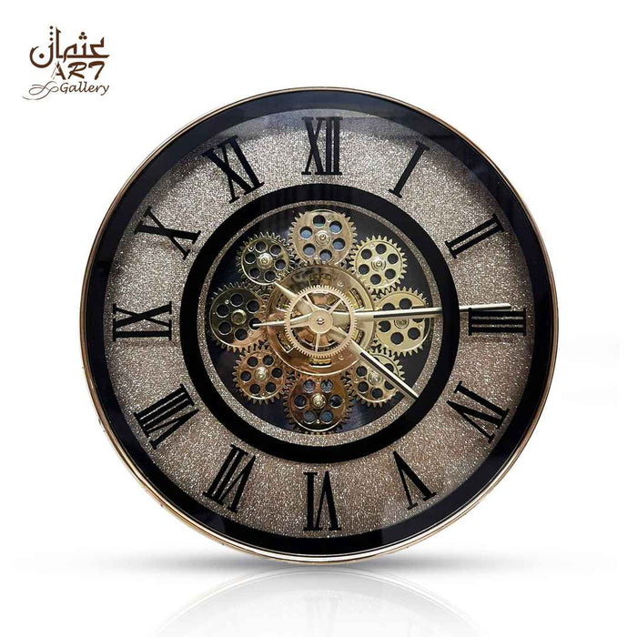
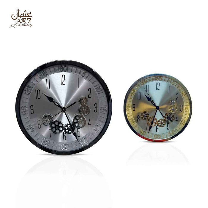
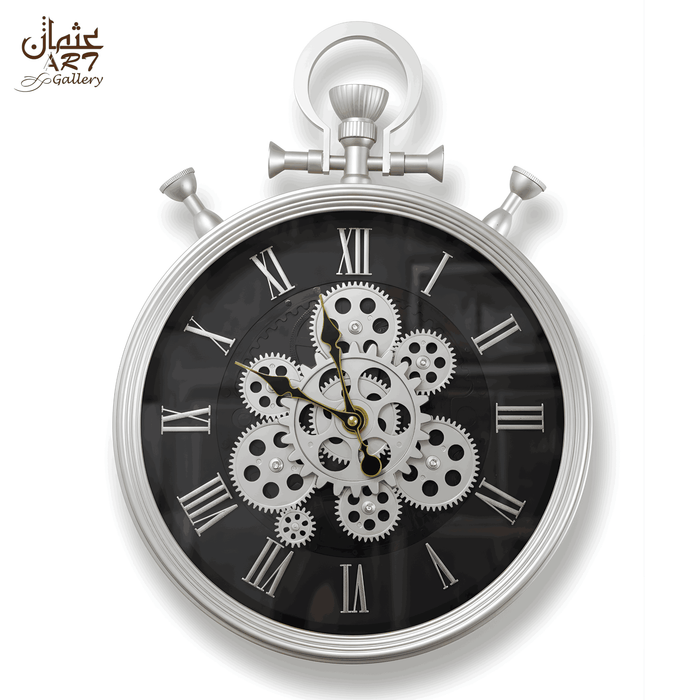
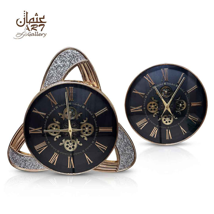
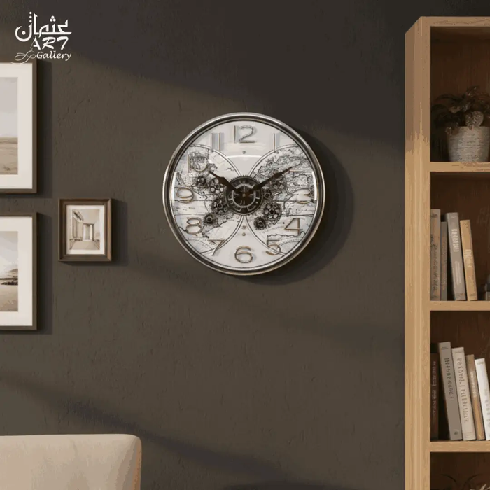
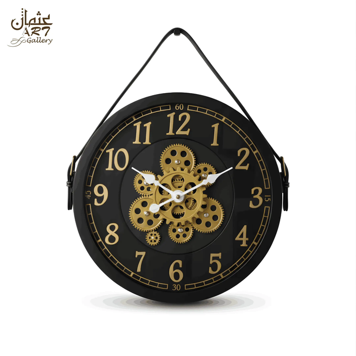
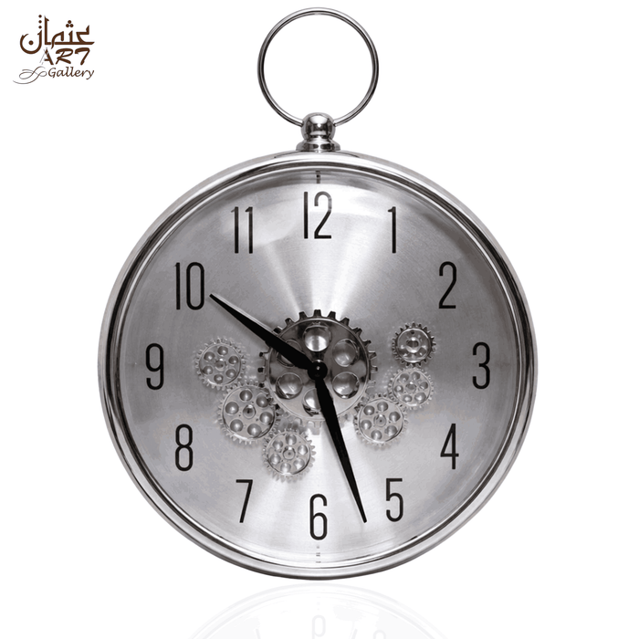
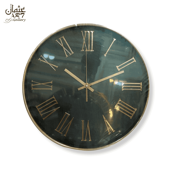
Silver wall clocks can introduce a cool metallic accent without adding another strong colour. In Pakistani living rooms, drawing rooms, bedrooms and offices, silver can connect naturally with grey, white, charcoal, black, navy, glass, marble and mirrored furniture. The result can feel clean and contemporary, but only when the clock has enough contrast to remain visible.
This guide explains silver versus grey, chrome-effect, gold and black; resin, Roman numeral and gear styles; wall colours, lighting, glare, room selection, size and visual weight. It also separates verified silver WeDecorators products from transparent, white, gold and black alternatives so colour and movement claims remain accurate. The aim is to help you move from simply wanting a silver clock to understanding which finish, contrast level and decorative style will actually suit your wall. You will also see what to verify before ordering online in Pakistan, including movement, battery, dimensions, current price, availability and whether decorative gears genuinely move.
Do Silver Wall Clocks Work With Neutral Interiors?
Yes. Silver wall clocks work particularly well with white, grey, charcoal, black, navy and cool greige because the metallic colour can repeat glass, marble, mirrors and chrome-effect details. Contrast still matters. A pale silver clock can disappear on a similar light-grey wall, while a highly reflective clock can become too dominant in a mirror-heavy room.
Silver can either coordinate or contrast. On a dark wall it becomes a brighter focal point. On a pale neutral wall it can create a softer tonal relationship. Choose the role first, then judge the clock's finish, outline, hands and numerals.
Key Takeaways
- Silver and grey are related but not interchangeable. Silver normally has a metallic visual character; grey may be completely matte.
- Silver can work with beige and cream when black, glass, grey marble, cool artwork or another small silver element connects the palette.
- Reflective finishes need window and spotlight checks because glare can reduce readability.
- Chrome-effect describes appearance, not confirmed chrome construction.
- Glitter, raised numerals, thick rims and dense detailing can increase visual weight.
- Visible gears do not prove mechanical movement or moving gears.
- Quartz does not automatically mean silent or non-ticking.
- Use actual listed dimensions rather than estimating size from lifestyle photographs.
The Silver Clock Balance Test
Use this six-factor framework to decide whether a clock will disappear, coordinate, contrast or dominate. It is a practical styling test, not a scientific score.
- Silver intensity: subdued, balanced or highly reflective.
- Wall contrast: the brightness and colour difference between clock and wall.
- Reflectivity: likely interaction with windows, lights, mirrors and glossy surfaces.
- Physical size: the real edge-to-edge diameter or full outer dimensions.
- Decorative complexity: glitter, raised numerals, layered frames or gear detailing.
- Existing cool-tone repetition: how much silver, glass, mirror, grey marble or black metal already exists nearby.
A quiet clock on a similar wall will coordinate softly. A bright, detailed clock on a dark wall will act more like statement wall art. A reflective clock in an already glossy room can dominate even at a moderate diameter.
Why Silver Wall Clocks Work in Modern Interiors
Silver Connects With Neutral Colour Schemes
Silver sits comfortably beside white, cool grey, charcoal, black, navy and blue-grey. It can connect a grey sofa, black side table, glass coffee table and marble console without introducing another strong colour.
Metallic Reflection Adds Light Interaction
Polished rims, glitter and crystal-effect surfaces change as light moves across them. This adds depth, but also means the clock should be checked for glare from the places where you normally view it.
Silver Works With Glass, Marble and Mirrored Furniture
These materials share a cool or reflective visual language. Controlled repetition works best. One clock and one or two supporting details usually feel more intentional than matching every accessory in silver.
Cool Metallic Details Can Reduce Visual Warmth
A silver clock can sharpen a beige, cream or walnut room, especially when grey marble, black furniture or clear glass already provides a cool bridge.
Silver Can Look Clean Without Feeling Minimal
Silver can appear on plain dials, decorative resin faces, Roman numeral frames and gear-inspired clocks. Colour and structure are separate decisions.
Where Silver Styling Can Go Wrong
Common problems include silver-on-grey low contrast, weak hand visibility, too many reflective accessories and cool lighting with no warm materials. Better contrast, quieter surroundings, wood and soft textiles usually solve them.
The Silver Intensity Scale
Silver intensity is not only about how shiny a product appears in a close-up image. The amount of exposed silver, the width of the rim, the colour of the centre and the texture of the face all affect how strongly the clock reads from across the room. A narrow metallic frame around a white dial may behave like a small accent, while an all-silver glitter face can act as a much stronger focal point.
Soft Silver Accent
Low-reflection silver suits bedrooms, offices and minimal rooms where the clock should support rather than dominate the interior.
Balanced Metallic Presence
Moderate silver works well in living rooms, drawing rooms and dining rooms. It is clearly metallic but still easy to balance with wood, fabric and stone.
Strong Reflective Statement
Highly polished or glittered silver belongs on a controlled feature wall. Check windows and spotlights carefully because reflections may cross the dial.
Main Silver Wall Clock Designs
Design type changes what the silver colour actually does in a room. A minimal clock uses silver mainly as an edge or marker colour. A resin clock can spread silver across most of the face. A gear design introduces shadows and multiple surfaces, while a Roman numeral design may let the wall show through the frame. Compare structure before deciding that two silver products will have the same visual effect.
Silver Resin Wall Clocks
Silver resin clocks can combine metallic colour with texture, glitter and raised numerals. Decorative surfaces often make them feel visually stronger than a plain clock of the same diameter. For material-specific guidance, use the resin wall clock selection guide.
Silver Gear Wall Clocks
Silver gear clocks can bridge industrial, contemporary and vintage-inspired rooms. Silver-and-wood versions add warmth. Do not assume visible gears move unless the listing explicitly confirms it. See the gear wall clock guide for deeper gear-specific advice.
Silver Roman Numeral Wall Clocks
Roman numerals give silver a more formal or architectural character. Open frames can feel lighter than solid layered faces. Readability depends on numeral size and contrast as much as the clock's diameter. See the Roman numeral wall clock guide.
Silver and Wood Wall Clocks
Silver and walnut creates warm-cool balance. Black wood feels sharper, light oak feels softer, and grey-toned ash produces a cooler tonal look.
Minimal Silver Clocks
Minimal silver clocks suit offices, bedrooms and uncluttered rooms. Their main buying check is readability, especially when pale hands or markers sit on a light face.
Glitter and Crystal-Effect Silver Clocks
These surfaces increase light interaction and visual weight. They work best on plain walls where sparkle is intentional rather than competing with reflective wallpaper or crystal lighting.
Large Silver Statement Clocks
Large clocks can anchor wide walls, but an open-frame design may still feel lighter than a smaller dense resin or gear clock. Judge physical size and visual weight together.
| Silver Clock Style | Visual Character | Reflectivity | Best Wall Colours | Suitable Rooms | Main Buying Check |
|---|---|---|---|---|---|
| Resin | Textured, decorative | Low to high | White, grey, charcoal, navy | Living, drawing, dining | Face texture and glare |
| Gear | Industrial-modern | Usually moderate | Grey, black, cream | Living, office, reception | Whether gears move |
| Roman numeral | Formal, classic-modern | Low to moderate | White, grey, navy | Drawing, dining, office | Numeral readability |
| Silver and wood | Warm-cool balanced | Moderate | Greige, cream, grey | Living, office, hallway | Wood undertone |
| Minimal | Restrained | Low to moderate | Charcoal, white, navy | Bedroom, office | Hand contrast |
| Glitter | Bright, glamour-led | Moderate to high | Plain white, charcoal, black | Living, drawing, reception | Window and spotlight glare |
| Statement | Focal, architectural | Varies | Plain neutral or dark wall | Large living, entrance | Full outer dimensions |
CTA: Compare current designs in the WeDecorators wall clock collection, then verify colour, dimensions, movement and availability on the individual product page.
Silver vs Grey Wall Clocks
Silver normally introduces a metallic or silver-coloured character, while grey describes a neutral colour that may be matte, warm, cool or non-metallic. Both can suit neutral interiors, but they create different levels of light interaction.
| Feature | Silver Wall Clock | Grey Wall Clock |
|---|---|---|
| Metallic character | Usually present visually | Not inherent |
| Reflectivity | Often moderate to high | Often low to moderate |
| Visual warmth | Usually cool | Can be warm, neutral or cool |
| Best pairing | White, charcoal, navy, contrasting grey | White, black, wood, tonal neutrals |
| Main role | Metallic accent or focal point | Quiet neutral integration |
| Main risk | Glare or low contrast | Looking flat or disappearing tonally |
Silver vs Chrome-Effect
Silver is a colour family. Chrome-effect is a polished reflective appearance. A silver clock may be chrome-effect, but that wording does not prove chrome material or plating. Keep material and appearance claims separate.
Silver vs Gold Wall Clocks
Silver generally creates a cooler relationship with grey, white, black, glass and mirrors. Gold adds warmth and connects naturally with cream, beige, walnut and warm lighting. Neither is universally better.
| Feature | Silver | Gold |
|---|---|---|
| Colour temperature | Cooler | Warmer |
| Best neutrals | Grey, white, charcoal | Cream, beige, ivory |
| Wood pairing | Walnut, black wood, oak, ash | Walnut, dark brown, warm oak |
| Metal relationship | Glass, mirror, chrome-effect | Brass-tone, warm metal |
| Main risk | Feeling cold or over-reflective | Feeling overly warm or ornate |
Silver vs Black Wall Clocks
Choose silver when you want a lighter metallic relationship with glass, mirrors or cool neutrals. Choose black when you need stronger graphic contrast and less reflection. On a pale wall, black is usually easier to see from a distance. On a dark wall, silver can become the clearer focal point. In mixed black-and-silver rooms, avoid making every object half black and half silver. A clearer hierarchy looks more considered.
Silver is lighter and more reflective. Black gives a stronger silhouette and easier contrast on pale walls. Silver-and-black combinations work well when black provides structure through hands, a dark centre or surrounding furniture while silver supplies highlights.
The Reflection vs Readability Test
- Hand-to-dial contrast: can the hands be distinguished quickly?
- Numeral-to-face contrast: do numerals remain visible in bright and low light?
- Window reflection: does daylight create a bright patch across the face?
- Spotlight reflection: does a ceiling or wall light produce a direct glare point?
| Reflection Source | Potential Effect | What to Check |
|---|---|---|
| Window | Moving bright reflection | Check more than one time of day |
| Ceiling spotlight | Intense highlight | See whether it crosses hands or numerals |
| Mirrored furniture | Extra light and visual competition | Decide whether the room already has enough shine |
| Glossy wall | Reduced separation | Look for a stronger outline or darker dial detail |
Product photography cannot fully predict real-room reflection because your light direction and viewing angles will differ. CCOHS guidance on glare explains that reflected glare can come from polished, shiny or glossy surfaces, which supports checking reflective clock faces in the actual room.
Best Wall Colours for Silver Clocks
The wall does more than supply a background colour. Its brightness, sheen and texture control how clearly the clock edge can be seen. A matte charcoal wall and a glossy charcoal wall may create very different results with the same polished clock. Treat the matrix below as a starting point, then test the actual room under its normal lighting.
White
Clean and bright, but pale silver can lose definition. Use a defined rim, raised numerals or darker hands.
Light Grey
Attractive but high-risk for tonal blending. Look for brightness difference, texture, shadow or dark details.
Mid Grey
Usually provides stronger separation from polished silver. Add cream fabric or wood if the palette feels too cool.
Charcoal
Creates strong brightness contrast and suits polished, glittered or open-frame silver designs.
Black
Produces dramatic contrast. Balance the dark wall with lighter upholstery, flooring or curtains.
Navy
Provides deep cool contrast with more colour than black. Cream upholstery and walnut can soften the result.
Blue-Grey
Creates a calm cool relationship. Use a brighter or textured silver so the clock remains visible.
Cool Greige
Bridges beige and grey, making silver easier to combine with walnut, cream and black.
Beige
Silver can act as a cool counterpoint. Grey marble, black or glass can connect the two temperatures.
Cream
Soft and warm. Restrained silver feels gentle; glitter silver produces stronger decorative contrast.
Deep Green
A rich dark background that makes silver appear crisp. Black, cream and glass keep it contemporary.
Textured Walls
Choose a clear outline and readable dial. On reflective wallpaper, reduce competing shine.
| Wall Colour | Silver Finish to Consider | Intended Effect | Contrast Risk | Supporting Materials |
|---|---|---|---|---|
| White | Textured or defined silver | Clean and bright | Medium | Black, walnut, glass |
| Light grey | Raised, textured or darker-edged | Tonal contemporary | High | Black, charcoal, wood |
| Mid grey | Balanced or polished | Cool contrast | Low-medium | Cream, walnut, glass |
| Charcoal | Bright polished or open | Strong focal point | Low | Light upholstery, marble |
| Black | Bright silver | Dramatic contrast | Low | White, cream, glass |
| Navy | Polished or brushed-looking | Layered cool contrast | Low | Walnut, glass, cream |
| Blue-grey | Brighter or textured | Soft coordination | Medium | White, ash, black |
| Cool greige | Balanced metallic | Warm-cool bridge | Low-medium | Walnut, cream, black |
| Beige | Restrained silver | Cool accent | Low | Grey marble, black, glass |
| Cream | Soft or decorative silver | Gentle contrast | Low | Walnut, stone, black |
| Deep green | Bright silver | Rich contrast | Low | Black, cream, glass |
The Silver-on-Grey Contrast Test
Grey walls deserve a separate test because grey can range from warm greige to cool blue-grey and from almost white to deep charcoal. The same silver clock may blend on one grey and stand out strongly on another. Wall sheen also matters. A matte grey wall can make a polished rim look clearer, while a satin or glossy grey may create more competing highlights.
Silver works on grey when there is enough separation in brightness, outline, hands, numeral relief or reflectivity. Compare five things: brightness difference, frame outline, hand colour, numeral relief and surface shine. A polished clock may look crisp on charcoal but disappear on pale silver-grey unless texture or darker details create definition.
Can Silver Work With Beige and Cream?
Yes. Silver can work in warm neutral interiors when another element connects the palette. Grey marble, black furniture, clear glass, cool artwork or one small silver detail can provide that bridge. Walnut, cream fabric and warm lighting stop the room from becoming cold.
Which Wood Tones Work With Silver?
Walnut
One of the strongest warm-cool balances. Useful in living rooms, drawing rooms and offices.
Dark Brown
Adds depth beneath silver. Use lighter walls or upholstery if the composition becomes heavy.
Black Wood
Sharp and contemporary, especially with white, charcoal and navy.
Light Oak
Soft and Scandinavian-inspired. Protect readability with clear hands or a defined rim.
Ash or Grey Wood
Creates cooler tonal integration. Add cream fabric or greenery if the room feels cold.
Very Orange Wood
Needs more careful balancing. Black, cream, stone or mixed artwork can bridge the warm wood and cool metal.
How Lighting Changes Silver
Lighting can alter both perceived colour and readability. The U.S. Department of Energy describes lower correlated colour temperatures as warmer in appearance and higher values as cooler, while Benjamin Moore colour guidance also notes that natural and artificial light can shift how neutral undertones appear. For a silver clock, the practical lesson is simple: judge the clock under the lighting you actually use, not only under daylight or showroom lighting.
Natural Daylight
Can reveal texture and make polished silver brighter, but direct window reflections may cross the dial.
Warm White Lighting
Softens silver and introduces warmer highlights, helping it sit comfortably with beige, cream and walnut.
Cool White Lighting
Emphasises crisp metallic character. Add wood or soft textiles if grey, glass and silver begin to feel cold.
Spotlights
Increase sparkle but can produce concentrated glare. Test the clock from normal viewing positions.
Low Light
Reduces sparkle and may make silver look greyer. Studio photography cannot guarantee how the finish will appear in your room.
Mirrors, Marble, Glass and Silver Clocks
Silver naturally connects with mirrored consoles, glass tables and grey or white marble. The strongest rooms use controlled repetition. If a glitter clock sits above a mirrored console beside a glass table and crystal light, reduce shine elsewhere so the clock still has a clear visual role.
The Cool-Material Balance Framework
- Silver clock: the cool metallic focal element.
- Hard reflective surface: marble, glass or a restrained mirror detail.
- Soft neutral texture: cream, grey or beige upholstery, curtains or rug.
- Warm balancing material: walnut, natural wood, warm stone or greenery.
For example: silver clock + grey-veined marble + cream sofa + walnut console. This is guidance, not a universal rule.
Best Rooms for Silver Wall Clocks
The best room is not necessarily the largest room. A silver clock succeeds where its scale, reflection and colour have a clear role. A compact hallway can suit a simple reflective clock if it has enough clearance. A large drawing room can still make a decorative clock feel lost if the wall is extremely wide or surrounded by larger furniture and artwork.
Living Room
Check the sofa or console width, viewing distance, wall colour and reflections. Grey and white create softer coordination; charcoal and navy make silver more prominent. Use the living-room wall clock guide for broader placement advice.
Drawing Room
Silver can work with formal beige or grey upholstery, marble, glass, mirrors, chandeliers and walnut. A silver-and-wood design adds warmth; glitter works best when surrounding décor is restrained. See the drawing-room clock guide.
Bedroom
Choose softer silver intensity and moderate decoration. If the clock is close to the bed, verify sound characteristics rather than assuming quartz is silent.
Dining Room
Silver can work beside a sideboard, glass or marble. Keep it visually separate from a large mirror or artwork.
Home Office
Prioritise readability and avoid high-glare placement opposite large windows.
Reception Area
Silver can connect with glass partitions and neutral corporate interiors. Ensure the dial remains readable from several positions.
Hallway
Consider projection and clearance. A reflective clock can brighten a corridor, but excessive shine can make a narrow space busy.
| Room | Silver Direction | Best Wall Types | Reflectivity | Main Size Concern | Biggest Risk |
|---|---|---|---|---|---|
| Living room | Balanced or statement | Plain neutral, charcoal, navy | Moderate | Relation to sofa/console | Glare or undersizing |
| Drawing room | Resin, Roman, silver-and-wood | Grey, beige, cream | Moderate | Competing furniture | Too many metallics |
| Bedroom | Soft or minimal | White, blue-grey, greige | Low | Open wall scale | Sound or sparkle |
| Dining room | Balanced decorative | Grey, cream, navy | Moderate | Sideboard relationship | Competing mirror/art |
| Office | Minimal and readable | White, grey, charcoal | Low-moderate | Viewing distance | Glare |
| Reception | Clean statement | Neutral corporate wall | Moderate | Multiple viewing angles | Decoration reducing clarity |
| Hallway | Soft or slim | White, grey, greige | Low-moderate | Projection | Crowding |
Silver Clock for Living Room
Before choosing a silver clock for living room use, decide whether it will sit above a sofa, console, sideboard or on an independent feature wall. A console normally creates a narrower visual zone, so a medium decorative clock may feel more intentional there than on a full sofa wall. If the clock sits opposite a window, check reflections from the main seating area rather than standing directly in front of it.
Choose a silver clock that is large enough to relate to the wall and furniture, readable from the normal seating position and reflective enough to add interest without fighting with windows, marble or mirrors. On white or light grey, use a defined rim, visible hands or textured face. On charcoal or navy, polished silver can provide stronger contrast. A 16-inch decorative clock may suit a defined wall area but can feel small on a very broad empty wall.
Silver Clocks for Pakistani Drawing Rooms
Silver works well with grey or beige upholstery, marble centre tables, glass side tables, mirrors, walnut, curtains and chandeliers. It can replace gold as the main metallic accent or coexist with limited warm metal. If crystal lighting and mirrored furniture already provide strong sparkle, choose a quieter silver finish.
How to Style Silver Wall Clocks
Silver + White + Charcoal
White wall, charcoal furniture, cream upholstery, one supporting silver detail. Avoid several mirror-finish accessories.
Silver + Light Grey + Black
Light-grey wall, black furniture, warm white lighting. Use dark hands or a defined rim so the clock does not disappear.
Silver + Navy + Glass
Navy wall, cream upholstery, walnut or black furniture, restrained glass. Avoid an all-blue-grey-silver scheme with no warmth.
Silver + Beige + Walnut
Beige wall, walnut furniture, cream upholstery, grey marble or black accents. Avoid making the clock the only cool object.
Silver + Marble + Cream
Soft neutral wall, cream upholstery, grey-veined marble and controlled glass. Avoid combining glitter, mirrored furniture and crystal lighting in one tight area.
Silver + Deep Green + Black
Deep green wall, black or walnut furniture, cream upholstery and warm lighting. Let one metallic finish dominate.
The 3-Texture Silver Rule
As a styling shortcut, combine three texture families rather than repeating only hard shiny surfaces. A simple formula is metallic silver + soft upholstery + wood or stone. It is not a scientific rule. It simply creates depth and prevents a neutral room from feeling flat or cold.
When Silver Can Look Cold, Cheap or Overdone
- Too many mirror finishes: keep one main reflective focal point.
- Reflective clock on reflective wallpaper: use a plainer wall or quieter finish.
- Silver too close to wall colour: increase outline, texture or hand contrast.
- Cool white light everywhere: add warmer light and softer materials.
- No wood or fabric warmth: introduce upholstery, curtains, rugs or timber.
- Glitter competing with crystal lighting: choose one main sparkle source.
- Weak numeral contrast: prioritise a clearer dial.
- Excess chrome-style surfaces: introduce matte black, wood or stone.
- Clock undersized for wall: test the real outline before ordering.
- Uncontrolled mixed metals: establish one dominant metal and limit the rest.
Matte, Brushed, Polished and Glitter Silver
Matte or Subdued Silver
Quiet, low-reflection and useful in bedrooms, offices or mirror-heavy rooms.
Brushed-Looking Silver
Textured and restrained. Only call an individual product brushed when that finish is verified.
Polished Silver
Brighter and more reflective, especially effective against charcoal, navy and black.
Glitter or Crystal Effect
Strongest light interaction and decorative weight. Best on a plain wall with controlled surrounding reflection.
How to Choose the Right Size
Choose size by measuring the usable wall, furniture below it, viewing distance and the clock's full outer dimensions, then adjust for visual weight. A glitter face, thick rim or dense gear centre can feel larger than a simple design of the same diameter.
Check whether the listed measurement includes decorative projections and outer frames. Then compare it with the sofa, console or sideboard below. For larger walls, use the large wall clock guide.
Wall Mock-Up Test
- Verify actual dimensions.
- Mark the outline with removable tape or paper.
- View it from normal seating.
- Compare it with furniture width.
- Check readability.
- Observe negative space.
- Check window reflection paths.
- Photograph the outline from the entrance.
- Compare another size if uncertain.
| Design Feature | Typical Visual Effect |
|---|---|
| Bright polished rim | Stronger highlight |
| Crystal-glitter face | Higher visual interaction |
| Large raised numerals | Stronger dial structure |
| Silver-on-silver palette | More unified appearance |
| Dark centre | Stronger contrast |
| Silver + wood | Warm-cool balance |
| Dense gear centre | Greater complexity |
| Transparent centre | Can feel visually lighter |
| Thick frame | Stronger presence |
| Plain silver face | Quieter appearance |
These are design tendencies, not scientific measurements.
Verified Silver WeDecorators Options
The distinction between direct recommendations and supporting comparisons is important for both shoppers and SEO accuracy. A product should enter the silver comparison only when the live listing currently verifies silver as part of its colour or finish. A transparent, grey, white or gold product may still help the shopper compare alternatives, but it should not be pulled into the silver category simply to make the table longer.
Product facts below were checked on 27 August 2026. Prices and availability can change.
| Product | Size | Silver Treatment | Style | Movement | Main Visual Feature | Suitable Buyer |
|---|---|---|---|---|---|---|
| Silver Resin Wall Clock | 16 inches diameter | Silver colour, silver-tone hands, chrome-effect rim | Decorative resin | Quartz | Crystal-glitter face, raised silver numerals | Direct verified silver focal point |
| Roman Gear | Listed as Large | Mix of silver and wood | Vintage-industrial Roman gear | Not specified | Metallic gear detailing | Silver mixed with warmer wood |
Silver Resin Wall Clock
The current listing shows 16 inches edge to edge, Silver colour, crystal-glitter resin face, raised silver numerals, silver-tone hands and a polished silver-tone chrome-effect rim. It uses quartz movement and one AA battery, not included. Current price: Rs.7,499; compare-at: Rs.8,500. The page shows “Notify Me When Available”. Do not call the rim chrome material or the movement silent.
Roman Gear
Roman Gear is listed as Mix of Silver, Wood, with “Large” as the dimension. It has Roman numerals and metallic gear detailing. Movement and moving-gear operation are not specified. Current price: Rs.7,999; compare-at: Rs.9,000. The page shows “Notify Me When Available”. Do not describe it as fully silver or mechanically moving.
CTA: For a direct silver example, review the Silver Resin Wall Clock. For a warmer mixed finish, compare Roman Gear.
Cool and Neutral Alternatives That Are Not Silver
| Product | Colour | Size | Style | Why Compare It With Silver |
|---|---|---|---|---|
| Transparent Gear | Transparent / Black | 20 inches | Transparent-background gear styling | Compares metallic weight with visual openness |
| Double Roman | White / Gold / Black | Listed as Large | Double-layer Roman with taper glass | Warm-metallic alternative to cool silver |
Transparent Gear is not silver. Double Roman is not silver. Keeping them separate protects colour accuracy while still helping shoppers compare visual directions.
Which WeDecorators Option Should You Choose?
Choose Silver Resin Wall Clock If...
You want a verified silver product, known 16-inch diameter, glitter resin face and raised numerals.
Choose Roman Gear If...
You want silver mixed with warmer wood and a vintage-industrial Roman character. Confirm the exact size before planning the wall.
Choose Transparent Gear If You Prefer Visual Openness...
It is a 20-inch Transparent / Black alternative, useful when you want cool-neutral styling without a solid metallic face.
Choose Double Roman If You Prefer Warm Gold...
Its White / Gold / Black palette, taper glass and golden Roman numerals suit rooms that need a warmer metallic direction.
Silver Wall Clock Price in Pakistan
Colour is therefore a poor shortcut for price. A low-cost silver plastic frame, a decorative resin clock, a large metal Roman design and a mirrored statement clock can all appear in the same search results while serving very different purposes. Compare diameter, materials, movement, finish, glass, numeral construction and seller support before deciding whether one price is genuinely better value than another.
Silver wall clock price in Pakistan depends on more than colour. Size, construction, resin treatment, glass, raised numerals, frame design, metallic finish, glitter, gear detailing, movement, sourcing and seller positioning all matter.
Current WeDecorators prices checked on 27 August 2026 are Rs.7,499 for Silver Resin and Rs.7,999 for Roman Gear. Both currently show “Notify Me When Available”, and promotions can change. Wider Pakistan results include inexpensive marketplace items and larger imported metal clocks, so compare like with like rather than treating every product labelled silver as equivalent.
For broader price factors, see the wall clock price in Pakistan guide.
Where to Buy Silver Wall Clocks in Pakistan
Pakistan search results currently mix specialist décor retailers, marketplaces and general home stores. Product titles often carry several marketing terms at once, including modern, luxury, silent, metallic or mirror. Treat each of those as a claim that must be supported by the specification. The most useful listing is not necessarily the longest one. It is the one that clearly states colour, construction, size, movement, power requirements and after-sales terms.
Verify colour, material wording, dimensions, movement, readability, current price, availability, delivery and returns before buying a silver wall clock online in Pakistan. Do not rely on the product title alone.
Distinguish silver from grey and transparent. Check whether chrome-effect is only a finish description. Review close-ups, exact dimensions, movement, battery requirements and whether decorative gears actually move. Use the wall clocks online Pakistan guide for broader ecommerce checks.
Online Buying Checklist
- Confirm actual silver colouring.
- Separate chrome-effect from material.
- Distinguish silver from grey.
- Confirm exact dimensions.
- Check movement.
- Check battery requirements and inclusion.
- Assess hand and numeral visibility.
- Consider window and spotlight glare.
- Compare with wall colour.
- Verify gear movement if relevant.
- Check materials and mounting.
- Confirm current PKR price and availability.
- Review delivery and returns.
- Inspect close-up images and video.
Common Buying Mistakes
- Treating silver and grey as identical. Check the actual colour and finish wording.
- Assuming chrome-effect means chrome material. Read material and finish separately.
- Adding reflective silver to a mirror-heavy room. Reduce surrounding shine.
- Using silver-on-grey without contrast. Compare brightness, outline, hands and numerals.
- Ignoring hand readability. Judge the dial from normal viewing distance.
- Ignoring window reflections. Check the intended wall through the day.
- Ignoring spotlight glare. Test with normal artificial lighting.
- Assuming quartz means silent. Look for a verified silent or sweep specification.
- Assuming decorative gears move. Require explicit confirmation.
- Calling Transparent Gear silver. Follow its Transparent / Black listing.
- Calling Double Roman silver. Follow its White / Gold / Black listing.
- Choosing only from lifestyle images. Use the listed dimensions and close-ups.
- Ignoring exact size. Create a wall mock-up.
- Comparing prices without construction. Compare size, material, movement and detail.
- Using only cool hard materials. Add wood, fabric, plants or stone.
- Matching every accessory in silver. Repeat metal selectively.
Care for Silver and Reflective Wall Clocks
Care should follow the actual surface rather than the colour name. A silver-coloured resin face, glass face, painted frame and metal frame may require different treatment. If the live product page only gives basic wiping instructions, stay within those instructions instead of assuming that a specialist metal, glass or resin cleaner is safe.
Dust with a soft microfibre cloth and use light pressure on polished or glittered surfaces. If the product guidance permits a slightly damp cloth, dry the surface immediately. Avoid abrasive pads, harsh solvents and aggressive metal polishes unless the manufacturer confirms compatibility.
Do not treat chrome-effect as proof that chrome cleaner is suitable. Do not spray liquid directly onto the clock or movement. Follow product-specific glass or resin care guidance where provided, and keep the wall mounting secure with fixings suitable for the wall type and clock weight.
Frequently Asked Questions
Are silver wall clocks modern?
Yes. Silver suits contemporary interiors because it connects naturally with grey, white, black, navy, glass and mirrors. The structure still matters. A minimal silver dial feels more contemporary than an ornate Roman or gear design, even when both use the same colour family.
Are silver wall clocks still in style?
Silver remains a practical neutral metallic option rather than a finish tied to one short-lived trend. Judge it by whether it works with your wall colour, furniture, lighting and existing materials instead of treating style as a universal yes-or-no question.
What colours go with a silver wall clock?
White, grey, charcoal, black, navy, blue-grey and cool greige work naturally. Beige and cream also work when another element such as grey marble, black furniture, glass, walnut or a restrained silver accessory connects the palette.
Does a silver wall clock work on a grey wall?
Yes, if there is enough contrast in brightness, outline, hand colour, numeral relief or reflectivity. Silver usually stands out more strongly on charcoal than on pale silver-grey, where texture or darker details may be needed.
Can a silver clock work with beige?
Yes. Silver creates a cool counterpoint to beige. Black, glass, grey marble or another small silver detail can bridge the colours, while walnut and cream fabrics keep the room warm.
Is silver or gold better for a neutral living room?
Neither is automatically better. Silver usually suits cooler grey, white and glass-led interiors. Gold usually connects more naturally with cream, beige, warm wood and amber-toned lighting. Choose according to the room's dominant temperature.
What is the difference between a silver and grey wall clock?
Silver normally has a metallic or silver-coloured visual character and often reflects more light. Grey is a neutral colour that may be matte, warm or cool. A grey clock can therefore create a quieter effect in the same room.
Is chrome-effect the same as silver?
No. Silver is a colour family, while chrome-effect describes a polished reflective appearance. Chrome-effect does not prove chrome material or plating. Check the separate construction specification.
What size silver wall clock should I buy?
Measure the usable wall and furniture below it, then mark the product's full outer dimensions with removable tape or paper. View the outline from normal seating positions and adjust for visual weight, because glitter and dense details can make a clock feel larger.
Is a 16-inch silver clock good for a living room?
It can be. A 16-inch decorative clock may suit a defined wall area, console or narrower sofa wall, but may feel small on a very broad empty wall. Test the exact outline before deciding.
Does reflective silver create glare?
It can. Polished, glittered and mirror-like surfaces may reflect windows and spotlights. Check the intended wall from the sofa, entrance or desk under both daylight and normal artificial lighting.
Are silver gear clocks mechanical?
Not necessarily. Silver describes colour and gear describes visual design. A gear-style clock may use quartz timekeeping and decorative cogs. Do not assume visible gears power the clock or rotate unless explicitly confirmed.
Are silver quartz wall clocks silent?
Not automatically. Quartz describes movement technology, not sound level. Look for a verified silent, non-ticking or sweep specification if sound matters, especially in a bedroom.
What is the silver wall clock price in Pakistan?
Prices vary with size, material, finish, resin or glass treatment, frame design and movement. On 27 August 2026, WeDecorators listed Silver Resin at Rs.7,499 and Roman Gear at Rs.7,999, but promotions and availability can change.
Where can I buy silver wall clocks online in Pakistan?
Compare specialist décor stores, marketplaces and WeDecorators, but verify actual colour, dimensions, material, movement, battery requirements, price, availability, delivery and returns before ordering.
Conclusion
The most reliable purchase decision combines design judgement with specification checking. A clock should look appropriate in the room, but it should also have enough factual information to remove avoidable uncertainty about colour, size, movement, power and installation.
Silver wall clocks work best when they are selected as part of the room's colour, lighting and material plan. Silver can brighten a neutral wall, connect with glass and marble or provide a cooler alternative to gold, but the finish still needs enough contrast to remain readable.
Use this sequence: decide silver intensity; distinguish silver from grey and chrome-effect; choose resin, gear, Roman or minimal styling; measure the wall; assess visual weight; check wall contrast, hands and numerals; review window and spotlight reflections; balance silver with wood, fabric or stone; verify movement and material; confirm current price and availability; then review delivery, mounting and returns.
For a directly verified silver option, the current Silver Resin Wall Clock provides a 16-inch crystal-glitter resin design. Roman Gear adds warmer wood to the silver palette. Transparent Gear and Double Roman remain non-silver comparisons. Keeping these categories separate makes the buying decision clearer and avoids treating every cool or neutral clock as though it were genuinely silver.
CTA: When ready, browse the WeDecorators wall clock collection and verify the live product specifications before ordering.

