
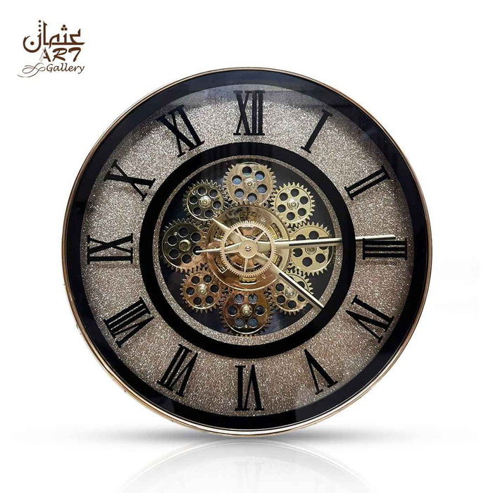
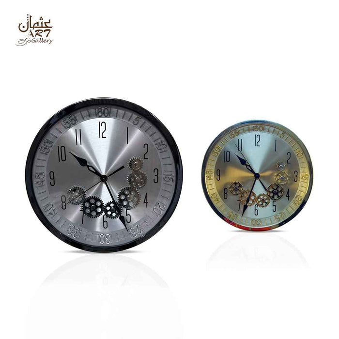
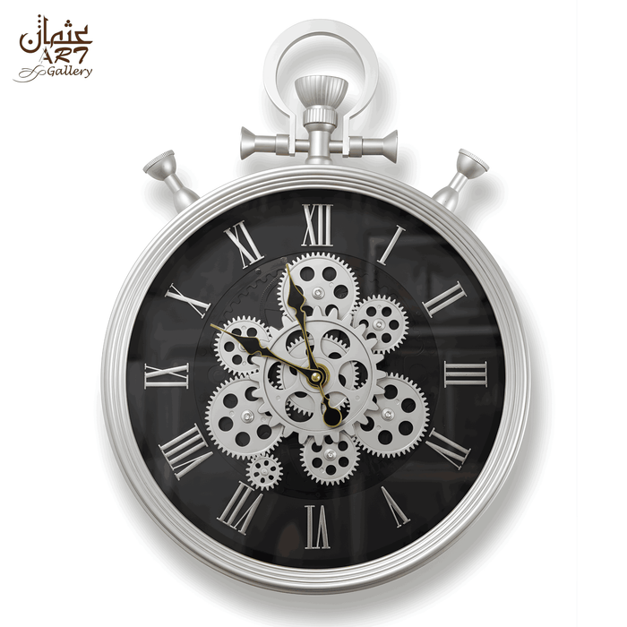
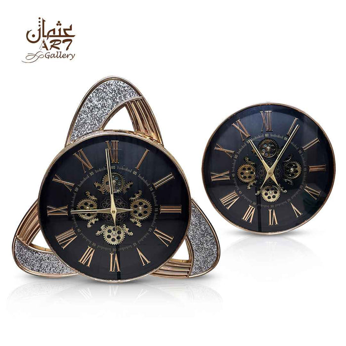
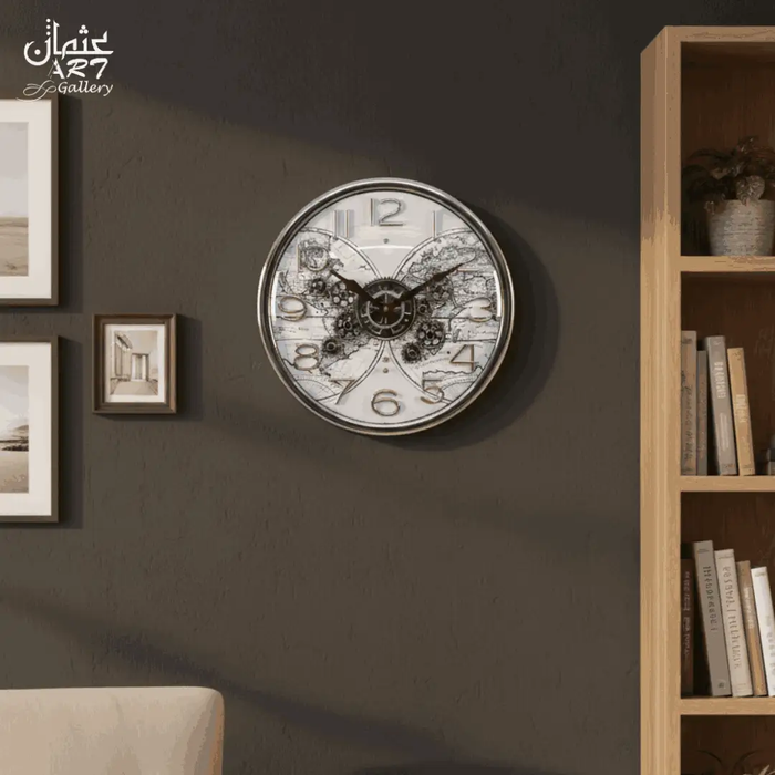
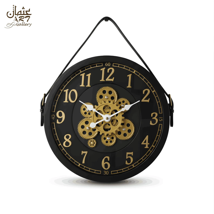
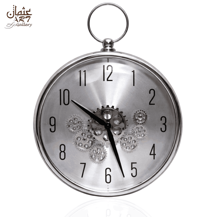
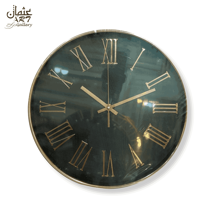
A black and gold wall clock can become one of the strongest visual features in a room because the two colours perform different jobs. Black gives the design definition and structure, while gold introduces warmth and a metallic-looking accent. Used carefully, the contrast can suit contemporary apartments, formal drawing rooms, offices and more traditional interiors.
The challenge is balance. Too much shiny gold can compete with lighting, mirrors, furniture handles and other accessories. Too much black can make a small wall feel visually heavy. Size matters too. A compact clock that looks substantial in a close-up photograph may feel undersized above a broad sofa.
This guide explains how to choose between black-dominant and gold-dominant designs, gear, Roman numeral and pendulum styling, wall colours, wood tones, lighting, room placement, visual weight and current WeDecorators options in Pakistan.
Do Black and Gold Wall Clocks Work in Modern Homes?
Yes. Black and gold wall clocks can work particularly well in modern homes when black provides the main visual structure, gold is used selectively, the wall gives the clock enough contrast and nearby metallic accessories remain restrained. The clock should also have enough scale for the furniture around it without making the wall feel crowded.
The combination is not automatically luxurious simply because gold is present. Its success comes from controlled contrast, proportion, readability and how the clock relates to the rest of the interior.
Key Takeaways
- Use black-and-gold as a controlled accent rather than repeating gold on every object.
- Black-dominant clocks usually feel visually stronger than gold-only designs.
- Gold-only and black-and-gold clocks create different effects and should not be grouped together.
- A 13-inch clock can suit a medium or compact wall but may feel small on a broad feature wall.
- Decorative gears should not be assumed to move.
- Quartz movement does not automatically mean silent operation.
- Warm lighting can make gold-tone surfaces appear warmer or more yellow.
- Wall colour, furniture, lighting and proportion matter more than trend labels.
The Black & Gold Clock Balance Test
Before choosing a clock, evaluate six factors together rather than judging the product photograph alone.
- Black-to-gold balance: Decide whether you want black to provide most of the visual structure or whether metallic gold should dominate.
- Wall contrast: Check whether the outer shape remains clearly visible against the wall.
- Clock size: Compare the stated dimensions with the actual wall and nearby furniture.
- Decorative complexity: Dense gear detailing requires more negative space than a simple dial.
- Furniture connection: Look for a relationship with walnut, black, charcoal or other furniture already present.
- Metallic repetition: Repeat gold selectively rather than matching every lamp, handle, frame and accessory.
A balanced black-and-gold room normally retains enough dark structure to keep the metallic accent controlled.
Why Black and Gold Wall Clocks Work
Black Creates Definition
Black creates a clear outline against cream, beige, ivory, warm white and many grey walls. It can also connect the clock visually with black furniture, dark shelving, television screens, picture frames or charcoal upholstery.
Gold Adds Warmth
Gold and gold-tone details introduce a warmer visual note. This can connect naturally with walnut furniture, warm lighting, beige upholstery, marble with warm veining and restrained brass-effect hardware.
Contrast Creates Focal Impact
A dark dial combined with gold markers or framing is easier to notice than a low-contrast design. That makes black-and-gold useful when the clock is expected to function partly as wall décor.
Metallic Details Connect With Furniture and Lighting
One gold-tone element elsewhere in the room can make the clock feel intentional. A pendant-light detail, mirror edge or small table accessory is often enough.
The Palette Works Across Classic and Modern Styles
Roman numerals can give the palette a classic architectural feel. Clean marker dials can appear more contemporary. Gear-inspired centres introduce mechanical character, while pendulum detailing adds a modern-classic reference.
Black Helps Control Decorative Gold
A substantial black dial or frame can stop metallic detailing from dominating the room. This is particularly useful in interiors that already include reflective marble, mirrors or polished lighting.
Where Black and Gold Can Go Wrong
Problems usually appear when the room contains several competing gold shades, very busy wallpaper, an undersized clock, difficult-to-read hands or too many neighbouring ornaments. The solution is usually reduction. Give the clock more clear wall area and let one metallic feature lead.
Black-Dominant vs Gold-Dominant Wall Clocks
| Design Direction | Visual Character | Best Wall Type | Furniture Pairing | Main Risk |
|---|---|---|---|---|
| Mostly Black + Gold Accents | Structured and contrast-led | Ivory, beige, warm white, light grey | Walnut, black, charcoal | Can feel heavy in a very small dark room |
| Balanced Black & Gold | Strong decorative statement | Neutral feature walls | Dark wood and restrained metallic details | Competing with other decorative objects |
| Mostly Gold + Black Detail | Warmer and more reflective | Cream, beige, dark green, charcoal | Walnut and dark brown | Too much metallic emphasis |
| Pure Gold | Warm metallic-led statement | Cream, beige and selected dark walls | Warm wood | Losing contrast or appearing over-coordinated |
The distinction matters because a shopper looking for a black and gold wall clock should not automatically be shown a pure-gold product as though the styling effect were identical.
Main Black and Gold Wall Clock Designs
Black and Gold Gear Wall Clocks
Gear-inspired clocks introduce greater visual complexity through layered cog shapes and mechanical-style centres. They suit living rooms, offices and feature walls where there is enough negative space around the clock. Decorative gears should not be described as moving unless that operation is specifically confirmed. For broader category guidance, see the WeDecorators gear wall clock guide.
Black and Gold Roman Numeral Clocks
Roman numerals give the dial stronger classical structure. They can work in formal drawing rooms and offices while still fitting contemporary furniture when the frame and detailing remain controlled.
Black and Gold Pendulum Clocks
Pendulum styling adds vertical character and can bridge traditional clock design with a contemporary round face. Check wall clearance below the main dial. Also verify whether the visible pendulum actually moves, because appearance alone does not establish its operation.
Simple Black Dial with Gold Markers
This is one of the easiest directions to style in an already furnished room. The lower decorative complexity makes it useful where curtains, artwork, wallpaper or furniture already provide strong pattern.
Sculptural Black and Gold Clocks
Sculptural designs extend beyond a conventional flat dial and therefore need more open wall area. Judge their full edge-to-edge dimensions rather than the size of the central time display alone.
Minimal Black and Gold Clocks
A minimal clock can still use black-and-gold effectively through a clean dark face, slim metallic markers and restrained framing. This direction suits offices, apartments and rooms where the clock should complement rather than dominate.
Black and Gold Clock Style Comparison
| Style | Visual Character | Complexity | Best Rooms | Wall Colours | Main Buying Check |
|---|---|---|---|---|---|
| Gear | Mechanical-inspired | High | Living room, office | Ivory, beige, grey | Confirm gear operation |
| Roman Numeral | Classic structure | Medium | Drawing room, office | Cream, greige, charcoal | Readability |
| Pendulum | Modern-classic | Medium-High | Living room, dining room | Warm neutrals | Clearance and pendulum operation |
| Simple Dial | Clean | Low | Bedroom, office | Most neutrals | Hand contrast |
| Sculptural | Art-led | High | Feature wall, reception | Plain walls | Total width and height |
| Minimal | Restrained | Low | Apartment, office | White, grey, beige | Viewing-distance readability |
The Gold Intensity Scale
Subtle Gold Accent → Balanced Metallic Contrast → Gold-Dominant Statement
Subtle Gold Accent
Best for minimalist rooms, grey interiors, offices and smaller spaces. Black remains the main structure while gold appears in hands, markers or a narrow rim.
Balanced Black + Gold
Suitable for modern living rooms, drawing rooms and neutral walls where the clock is meant to become a noticeable focal feature.
Gold-Dominant
Works best when surrounding décor is controlled. Dark wood, charcoal and dramatic feature walls can support a stronger metallic presence without requiring every accessory to match.
Black and Gold vs Gold-Only Wall Clocks
| Feature | Black & Gold Clock | Gold-Only Clock |
|---|---|---|
| Contrast | Usually stronger | Usually softer |
| Warmth | Balanced by black | More consistently warm |
| Visual weight | Often stronger because of dark structure | Depends heavily on frame and reflectivity |
| Best wall colours | Ivory, beige, greige, light grey | Cream, beige, charcoal, deep green |
| Furniture pairing | Black, walnut, charcoal | Walnut, dark brown, warm neutrals |
| Main risk | Too much visual complexity | Too much metallic emphasis |
Black and Gold vs Silver
Black-and-gold generally creates a warmer, more contrast-led effect. Silver tends to feel cooler and can connect naturally with grey, white, chrome, glass and cooler blue interiors. Neither colour is inherently more premium. The better choice is the one that supports the room's existing finishes.
Black and Gold vs Bronze
Gold gives a cleaner metallic warmth that can work across modern and classic interiors. Bronze normally has an aged, deeper character and therefore connects more naturally with vintage, antique-inspired or industrial rooms. Choose according to the furniture and architectural mood rather than treating either finish as universally superior.
Best Wall Colours for Black and Gold Clocks
| Wall Colour | Black & Gold Effect | Gold Intensity | Furniture Pairing | Main Check |
|---|---|---|---|---|
| Ivory | Clear contrast with warmth | Low to balanced | Walnut, beige | Avoid too many cream-gold accessories |
| Warm White | Crisp outline | Flexible | Black, walnut | Check glare under direct lighting |
| Cream | Soft warm backdrop | Balanced | Brown, walnut | Keep enough black definition |
| Beige | Natural warm connection | Balanced | Dark wood, black | Avoid excessive gold repetition |
| Greige | Modern neutral balance | Subtle to balanced | Charcoal, ash, walnut | Check gold tone under cool lighting |
| Light Grey | Strong black contrast | Prefer restrained gold | Black, grey wood | Very yellow gold may feel disconnected |
| Charcoal | Dramatic | Gold can be stronger | Walnut, black | Ensure black outline remains visible |
| Navy | Formal and dramatic | Balanced | Dark wood | Check hand readability |
| Deep Green | Rich warm contrast | Balanced to stronger | Walnut | Avoid too many other metallic pieces |
| Wood Panelling | Layered and architectural | Usually restrained | Matching wood furniture | Ensure the clock silhouette separates from grain |
For broader colour coordination beyond black-and-gold, use the WeDecorators clock colour guide.
The Wall Contrast Test
Before ordering, check four different kinds of contrast:
- Clock outline versus wall: Can you clearly see the frame from across the room?
- Hands versus dial: Can you read the time without concentrating?
- Numerals versus face: Do decorative details interfere with the time display?
- Gold versus lighting: Does direct light create glare or make the metallic-looking details appear substantially warmer?
A decorative clock can be visually impressive and still be a poor everyday timepiece if its hands disappear into the centre.
Explore black-and-gold designs only after you have identified the wall colour, available space and amount of metallic detail already present in the room.
Which Wood Tones Work With Black and Gold?
Walnut
Walnut is one of the easiest natural pairings because its brown warmth connects with gold while its darker grain supports black.
Dark Brown
Dark brown furniture produces a more formal result and works particularly well in drawing rooms and offices.
Teak and Warm Wood
Warm wood can bridge traditional furniture with a more contemporary black-and-gold clock.
Black Furniture
Black consoles, shelving or side tables create direct continuity with a black-dominant clock. Use gold more sparingly elsewhere.
Grey and Ash Wood
Cooler woods can work when the gold is restrained. Greige walls can help bridge the warm and cool elements.
Very Orange Wood
Strong orange undertones require more care. Too much yellow-gold beside orange wood can make the palette excessively warm.
How Lighting Changes Gold
Lighting can noticeably alter the way gold-tone details are perceived. Warm white lighting can make them appear richer, warmer or more yellow. Cooler white light can make the same finish appear more neutral. Daylight also changes throughout the day, so a clock may not look identical in morning light, evening light and artificial lighting.
Reflective rims and polished details can also create glare under spotlights. Before deciding that a product colour is wrong, consider whether the difference comes from the clock itself, the room lighting, the camera or the screen displaying the photograph.
Best Rooms for Black and Gold Wall Clocks
| Room | Best Direction | Main Placement | Scale Concern | Biggest Mistake |
|---|---|---|---|---|
| Living Room | Balanced or black-dominant | Sofa or console wall | Wide furniture can dwarf a compact clock | Too many nearby ornaments |
| Drawing Room | Balanced / Roman / pendulum | Formal seating or console wall | Patterned décor already adds visual weight | Repeating gold everywhere |
| Dining Room | Balanced | Sideboard or clear wall | Check relationship with dining lighting | Glare from pendant lights |
| Home Office | Black-dominant or gear | Desk-facing wall | Readability matters | Overly complex dial |
| Reception | Statement direction | Behind or opposite reception desk | Long viewing distance | Choosing too small a face |
| Hallway | Compact / cleaner design | End wall or console | Short viewing distance | Excessive projection or detail |
| Bedroom | Restrained | Side wall or dresser | A large dark clock may dominate | Assuming quiet operation without verification |
Black and Gold Clock for Living Room
A black and gold clock for a living room works best when its scale relates clearly to the sofa, console or sideboard beneath it and the clock is given enough negative space to function as a focal point.
A light neutral wall gives a black dial strong definition, while walnut or dark furniture can connect the clock with the lower half of the room. If the sofa is particularly wide, do not assume a 13-inch clock will provide sufficient visual presence. Mark its diameter on the wall first.
For broader room-wide advice, see the wall clocks for living rooms guide.
Black and Gold Clock for Pakistani Drawing Rooms
Pakistani drawing rooms often combine cream or beige walls, substantial brown or walnut furniture, patterned curtains, marble tables, mirrors and warm false-ceiling lighting. That creates an ideal background for black-and-gold, but also a higher risk of over-decoration.
Use the clock as one of the main metallic focal points instead of pairing it with gold curtains, several gold frames, a large gold mirror and multiple metallic table ornaments at the same time. A dark dial can connect with wood and black furniture while the gold detail echoes one smaller feature such as a lamp, mirror edge or handle.
For broader drawing-room styling, see the fancy wall clocks for drawing rooms guide.
How to Style a Black and Gold Wall Clock
Black + Gold + Ivory + Walnut
Use an ivory wall, walnut console and neutral upholstery. Repeat gold once in a lamp or narrow mirror edge. Avoid several large metallic ornaments.
Black + Gold + Greige + Charcoal
Choose a black-dominant clock with restrained gold, charcoal seating and a greige wall. Keep other metals muted so the warmer clock remains intentional.
Black + Gold + Beige + Dark Wood
This works naturally in formal living and drawing rooms. Use beige upholstery, dark wood and warm lighting. Avoid matching every decorative object to exactly the same gold colour.
Black + Gold + Deep Green + Walnut
A deep green feature wall can support stronger gold detailing. Walnut maintains warmth, while cream upholstery prevents the palette from becoming too dark.
Black + Gold + White + Modern Furniture
Use crisp white walls, clean-lined furniture and limited accessories. A simpler black-and-gold face normally works better than an ornate clock in a minimalist scheme.
The 3-Point Metallic Repeat Rule
An easy editorial approach is to repeat gold through roughly three visual touchpoints:
- the clock
- a lamp, pendant or mirror detail
- one smaller table, hardware or decorative accent
This is not a scientific formula. The objective is simply to make the metallic colour feel connected without turning every accessory into a matching set.
When Black and Gold Can Look Cheap or Overdone
- Too many shiny gold surfaces: Remove secondary metallic accessories.
- Mismatched gold tones: Let one tone dominate instead of forcing an exact match.
- Glossy gold plus busy wallpaper: Move the clock to a calmer wall or choose a simpler face.
- Ornate clock plus ornate furniture: Reduce neighbouring décor.
- Harsh reflections: Adjust direct spotlights where possible.
- Too many black accessories: Introduce lighter upholstery or wall area.
- Clock visibly undersized: Test a larger outline before ordering.
- Numerals disappearing into the centre: Prioritise contrast over decoration.
- Excessive metallic repetition: Keep only a few deliberate connections.
Matte vs Glossy Black and Gold
Matte black generally controls reflections and gives the design a firmer visual structure. Glossy black creates more reflection and can appear more dramatic. Brushed or muted gold tends to feel calmer, while highly polished gold draws more attention to itself.
These are general styling tendencies. Do not assign a particular finish to a product unless its listing confirms it.
How to Choose the Right Clock Size
Do not judge size only by diameter. Consider total width, total height, viewing distance, numeral size, frame thickness, decorative complexity and how much empty wall remains around the clock.
A 13-inch clock may work naturally above a compact console, in a hallway, office or medium wall area. The same clock can feel isolated above an exceptionally wide sofa. A larger or more visually complex clock may appear substantial even when the numeric difference in diameter is modest.
The Wall Mock-Up Test
- Verify the exact dimensions.
- Mark the outline on the wall with removable tape or paper.
- Stand at your normal viewing distance.
- Compare it with the sofa, console or sideboard.
- Check how much clear wall remains visible.
- Decide whether the black areas feel visually heavy.
- Photograph the mock-up.
- Compare a second size if you remain uncertain.
If you are dealing with a broad feature wall, the large wall clock guide provides more dedicated sizing context.
Physical Size vs Visual Weight
| Design Feature | Typical Effect |
|---|---|
| Black outer frame | Greater visual weight |
| Large black dial | Stronger presence |
| Gold markers only | Controlled metallic accent |
| Dense gear centre | More visual complexity |
| Gold-dominant face | Stronger metallic presence |
| Open frame | Can feel visually lighter |
| Pendulum extension | Adds vertical presence |
| Thick rim | Stronger silhouette |
| Large numerals | Stronger face structure |
These are design tendencies, not scientific measurements.
Verified WeDecorators Black and Gold Wall Clocks
| Product | Size | Black & Gold Format | Dial Style | Decorative Feature | Movement | Suitable Buyer |
|---|---|---|---|---|---|---|
| Premium Gear Clock | 13 inches | Wing and Non Wing variants | Roman numerals | Gear/mechanical-inspired detailing | Not specified | Roman numeral and gear-style preference |
| Fancy Gear Clock | 13 inches | Black & Gold variant | Arabic numerals | Layered decorative gear-inspired centre | Not specified | Compact decorative gear styling |
| Gold Pendulum Wall Clock | 16 inches | Black and gold | Analogue marker-led face | Visible decorative pendulum element | Not provided | Larger modern-classic statement |
The current listings show Rs.12,499 for Premium Gear, Rs.6,999 for Fancy Gear and Rs.7,499 for Gold Pendulum. Prices and availability were checked on 27 August 2026 and can change. All three pages currently display “Notify Me When Available”.
Want Gold Without Black?
The gold-only Luxury Gear Clock is currently offered in Gold and Silver rather than a black-and-gold variant. Its 13-inch format and gear-inspired face make it useful as a comparison for shoppers who want a warmer metallic-led appearance without the strong dark contrast of a black dial.
The listing currently states battery-powered operation, but the exact movement, decorative gear operation and material are not confirmed. The current price is Rs.12,499 and the page displays “Notify Me When Available”.
Which WeDecorators Clock Should You Choose?
Choose Premium Gear Clock If...
You prefer Roman numerals, black-and-gold styling and a compact 13-inch gear-inspired appearance.
Choose Fancy Gear Clock If...
You prefer Arabic numerals, a detailed central gear motif and the lower current price among the three verified black-and-gold products.
Choose Gold Pendulum Wall Clock If...
You want a larger 16-inch format and visible pendulum character. Verify pendulum operation separately if movement is important to you.
Choose Gold-Only Luxury Gear If...
You want metallic warmth without a black-and-gold palette.
Choose Roman Numerals If...
You prefer a more classical, architectural dial structure.
Choose Arabic Numerals If...
You want familiar everyday number recognition around a decorative centre.
Choose Gear Styling If...
You want greater mechanical-inspired detail and have enough clear wall space to accommodate it.
Choose Pendulum Styling If...
You want added vertical character and a stronger traditional clock reference within a modern decorative design.
Compare the Premium Gear Clock, Fancy Gear Clock and Gold Pendulum Wall Clock according to room size and design rather than price alone.
Black and Gold Wall Clock Price in Pakistan
The black and gold wall clock price in Pakistan varies because colour alone says very little about what you are buying. Two clocks can use a similar palette while differing substantially in diameter, construction, decorative complexity, movement, imported sourcing, frame design and product information.
Gear-inspired centres, larger frames, layered faces and pendulum detailing may increase decorative complexity. Roman or Arabic numerals mainly affect visual character rather than providing a reliable indicator of price. Materials can also matter, but only when the seller actually specifies them.
Current WeDecorators examples checked on 27 August 2026 range from Rs.6,999 for the 13-inch Fancy Gear Clock to Rs.12,499 for Premium Gear. Gold Pendulum is currently Rs.7,499. These are live promotional prices at the time of checking and should not be treated as permanent market prices.
For broader category-level pricing rather than this colour-specific comparison, use the wall clock price guide for Pakistan.
Where to Buy Black and Gold Wall Clocks in Pakistan
When buying a black and gold wall clock online in Pakistan, start with product information rather than the lifestyle image. Verify dimensions, selected colour, numeral readability, movement, material, battery requirements, mounting, decorative gear operation, pendulum operation, current PKR price, availability, delivery and returns.
WeDecorators offers several relevant black-and-gold designs online. For a wider pre-order process, see the guide to buying wall clocks online in Pakistan.
Online Buying Checklist
- Confirm that the selected variant is actually black and gold.
- Confirm exact edge-to-edge dimensions.
- Check the black-to-gold balance.
- Assess numeral and hand readability.
- Check movement type.
- Check battery requirements.
- Confirm whether decorative gears move if relevant.
- Confirm pendulum operation if relevant.
- Check the material specification.
- Compare the colour with your wall.
- Consider surrounding wood tones.
- Check the room lighting.
- Assess visual weight.
- Check mounting information.
- Confirm current PKR price.
- Check current availability.
- Review delivery information.
- Review return or exchange terms.
- Inspect close-up photographs or video.
Common Black and Gold Clock Buying Mistakes
- Assuming every gold clock is black-and-gold. Check the exact colour variant.
- Choosing too much gold for the room. Reduce secondary metallic accessories.
- Ignoring gold-tone differences. Judge the complete palette rather than demanding identical metallic shades.
- Matching every accessory in gold. Use selective repetition.
- Choosing from lifestyle photographs without measuring. Make a full-size wall mock-up.
- Ignoring visual weight. Consider dark dial area and decorative density as well as diameter.
- Using a detailed gear clock on an already busy wall. Create more negative space.
- Assuming decorative gears move. Require explicit confirmation.
- Assuming quartz means silent. Verify silent, sweep or non-ticking claims separately.
- Ignoring hand and numeral contrast. Check everyday readability.
- Buying a 13-inch clock for an extremely wide blank wall without checking scale. Test the outline first.
- Treating “luxury” as a material specification. Verify actual construction separately.
- Ignoring lighting. View metallic finishes under the room's normal lighting.
- Comparing prices without comparing size and design. Compare what each price actually includes.
How to Care for a Black and Gold Wall Clock
Use a clean, soft microfibre cloth for routine dusting. Work gently around hands, numerals, decorative gears and pendulum details. Avoid abrasive pads because they can mark transparent surfaces or decorative finishes.
Do not spray cleaning liquid directly onto the clock. Moisture can enter the dial or movement area. If a light wipe is required, apply a small amount of suitable cleaner to the cloth rather than the product, provided the clock's material is compatible with it.
Avoid harsh chemicals and specialised metal polishes unless the construction and finish have been confirmed. A gold colour does not prove that an element is brass, plated metal or any other specific material.
Keep the clock away from excessive moisture and direct heat, and follow any product-specific care instructions supplied by the seller.
Frequently Asked Questions
Are black and gold wall clocks still stylish?
Yes. Black-and-gold remains a usable interior colour combination rather than depending on a single short-lived trend. The result feels current when the clock suits the wall, furniture and room scale and the gold is not repeated excessively.
Do black and gold clocks work in modern homes?
Yes. Cleaner black-and-gold dials can fit minimal interiors, while gear, Roman numeral and pendulum designs create stronger statements. Choose the level of detail according to how busy the rest of the room already is.
What wall colour suits a black and gold wall clock?
Ivory, warm white, cream, beige, greige and light grey are flexible choices. Charcoal, navy and deep green can also work, but check whether the black parts of the clock remain visible against a darker wall.
Does black and gold work with beige or grey walls?
Yes. Beige naturally supports warm gold while black adds definition. On grey walls, black-and-gold can create strong contrast, although a restrained gold tone usually integrates more easily with a cooler interior.
What furniture suits a gold wall clock?
Walnut, dark brown, black and selected warm woods work particularly well. Grey or ash furniture can also suit black-and-gold when the metallic accent is controlled and other room colours help bridge warm and cool tones.
Is black and gold too much for a small living room?
Not necessarily. Use a black-dominant design with restrained gold and avoid surrounding it with several metallic accessories. Decorative complexity and visual weight can matter as much as the physical diameter.
What size black and gold clock should I buy?
Measure the usable wall and nearby furniture, then mark the exact proposed size on the wall. Consider viewing distance and visual weight rather than applying one universal percentage rule to every room.
Is a 13-inch clock large enough for a living room?
It can be. A 13-inch clock may suit a compact living room, medium wall or console arrangement. It may look undersized when used alone above a broad sofa or large feature wall, so test its outline before ordering.
What is the difference between black-and-gold and gold-only clocks?
Black-and-gold usually creates stronger contrast and connects easily with dark furniture. Gold-only designs create a warmer, more metallic-led effect. Neither is universally better. The correct choice depends on the room palette.
Do black-and-gold gear clocks have moving gears?
Not automatically. Visible cogs may be purely decorative. Only describe a clock as having moving or rotating gears when the seller explicitly confirms that operation for the specific model.
Are black-and-gold pendulum clocks mechanical?
Not necessarily. A visible pendulum does not prove that the clock uses a mechanical movement or that the pendulum regulates time. Movement and pendulum operation should be checked separately.
What is the black and gold wall clock price in Pakistan?
Prices vary significantly according to size, construction, movement, decorative complexity and seller. Current WeDecorators black-and-gold examples checked on 27 August 2026 range from Rs.6,999 to Rs.12,499, but promotional prices and availability can change.
Where can I buy black and gold wall clocks online in Pakistan?
WeDecorators currently lists black-and-gold gear, Roman numeral and pendulum designs online. Before ordering, verify the selected variant, dimensions, movement, mechanism details, current price, availability, delivery and return conditions.
Final Thoughts
A black and gold wall clock works best when it is treated as part of the whole room rather than an isolated decorative purchase. Start by deciding whether you want a black-dominant, balanced or gold-dominant appearance. Then choose between gear, Roman numeral, pendulum or simpler styling.
Measure the wall and assess visual weight before ordering. Compare the clock with your wall colour, wood tone and lighting. Keep metallic repetition controlled and check whether the hands and numerals remain readable from the normal viewing position.
Finally, verify the practical details. Confirm movement, battery requirements, decorative gear operation or pendulum operation where relevant, current price and availability, delivery terms and returns. Never infer these features from appearance alone.
Once those checks are complete, compare the relevant WeDecorators black-and-gold designs and choose the clock whose scale, contrast and level of detail genuinely suit the room.

