
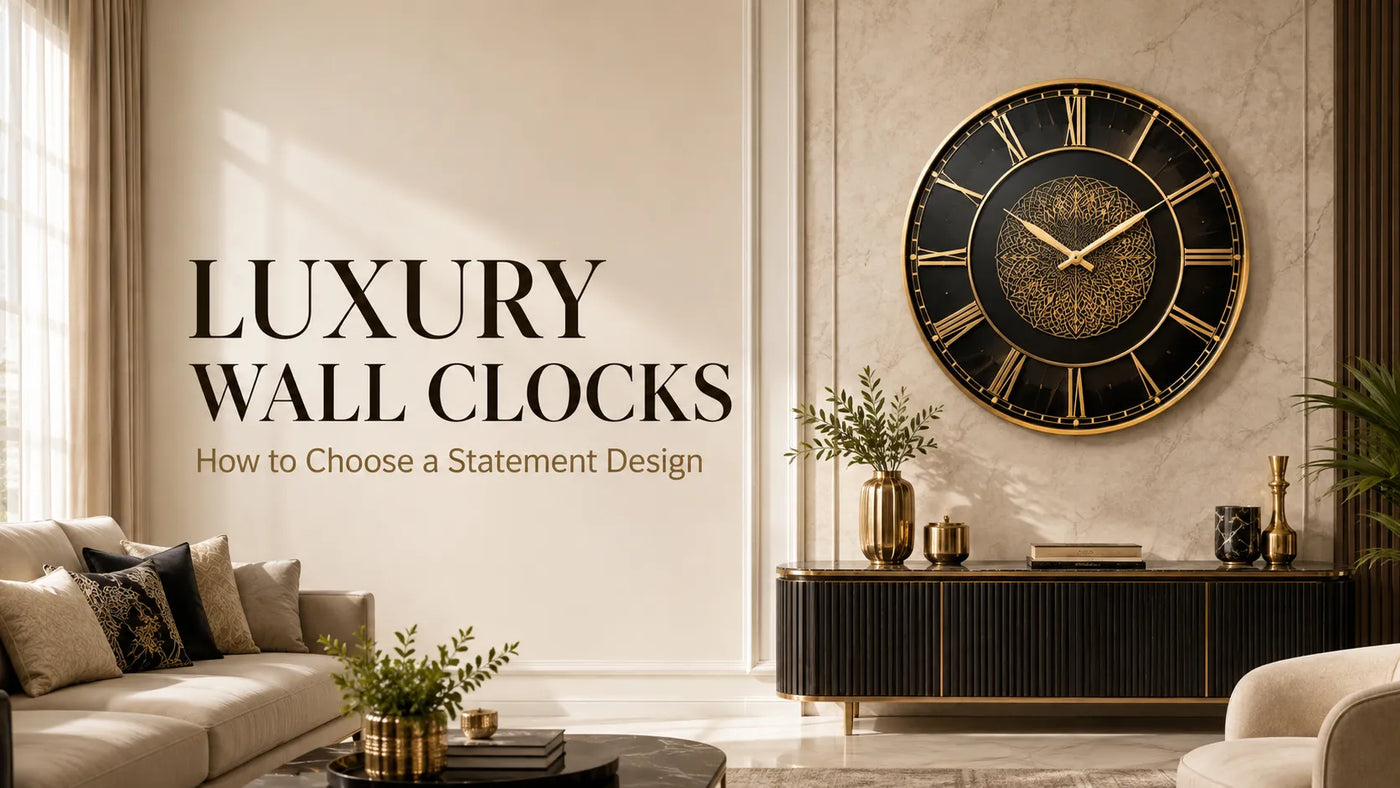
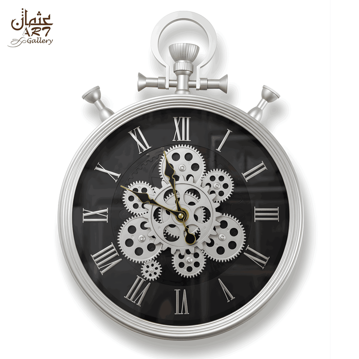
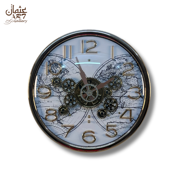
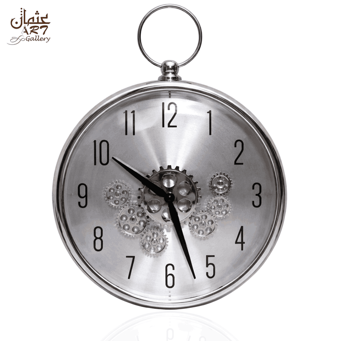
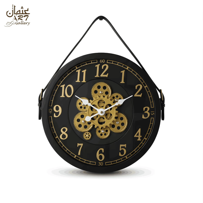
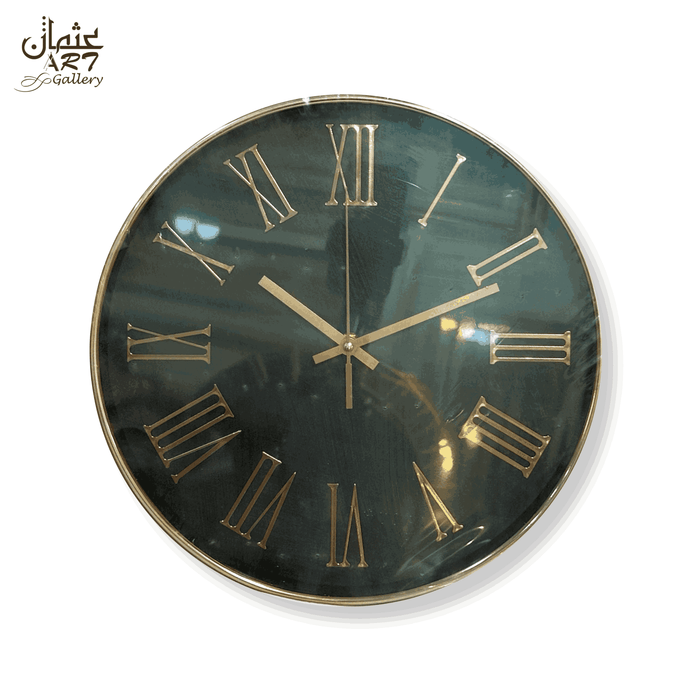
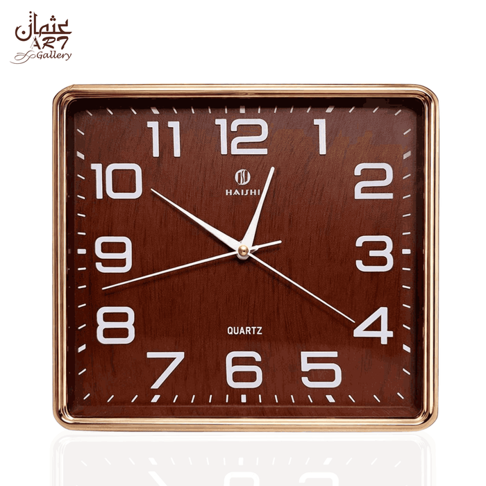
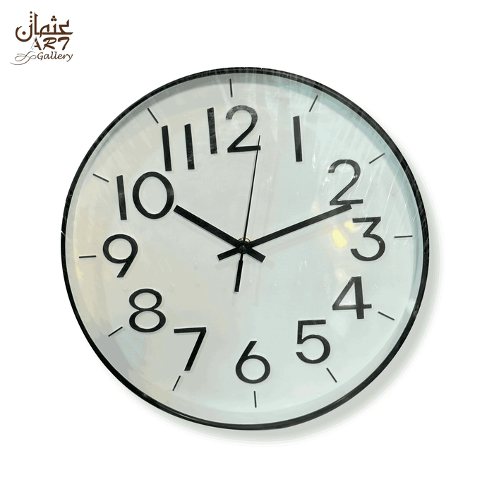
Luxury wall clocks do more than display the time. Chosen carefully, they can organise a blank wall, strengthen the room’s colour palette and create a focal point that connects furniture, lighting and decorative finishes. However, an ornate face, metallic colour or higher price does not automatically make a clock suitable for a statement interior.
The right choice depends on proportion, visual weight, wall colour, readability, room style and everyday function. A clock that looks impressive in a close product photograph may feel too small above a wide sofa, too busy against patterned wallpaper or difficult to read from across the room.
This guide explains how to choose luxury wall clocks for Pakistani homes using the SCALE Statement Clock Framework. You will learn how to evaluate usable wall space, match finishes with your interior, compare gear, Roman numeral, vintage and pendulum designs, and verify important details before ordering online.
Readers who need broader advice about standard, decorative and functional clock selection can also read the complete wall-clock buying guide. This article focuses specifically on choosing a statement clock as part of an interior composition.
Key Takeaways
- A statement clock should relate to the usable display area, not simply the full dimensions of the wall.
- Visual weight can affect the result as much as the clock’s physical diameter.
- Gold, bronze and decorative gear clocks usually need negative space around them.
- A clock face should remain readable from the room’s normal viewing distance.
- Visible gears do not automatically mean that a wall clock has a mechanical movement.
- The sofa, console, sideboard or dining furniture should guide alignment and scale.
- The clock should connect with at least one existing element, such as colour, shape, finish or proportion.
- Online shoppers should verify exact dimensions, movement, weight, colour, hanging requirements and current availability.
What Makes a Wall Clock Look Luxurious?
A wall clock looks luxurious when its proportions, finish, face design and placement feel deliberate. Balanced detailing, consistent colour, readable hands and enough surrounding space usually create a more refined result than excessive ornamentation. A clock can be expensive without looking appropriate, while a restrained design can appear high-end when it suits the wall and furniture.
It is useful to separate four commonly confused ideas:
- Expensive: This refers only to price. A costly clock may still look poorly proportioned or unsuitable for the room.
- Premium: This generally describes perceived quality, finish or presentation, although the term should be supported by accurate product information.
- Luxury-looking: This describes a controlled visual result based on proportion, consistency, restraint and compatibility.
- Statement-making: This means the clock attracts attention and gives the wall a clear visual centre.
A successful statement wall clock normally combines one or two dominant features. These might include bold Roman numerals, an open-frame dial, visible decorative gears, a sculptural surround, black-and-gold contrast or a pendulum-style silhouette. Problems begin when too many features compete at the same intensity.
For example, a clock with a broad metallic frame, several decorative gears, thick numerals, detailed hands and a patterned centre can look visually heavy. Such a design may still work in a large drawing room with a plain wall, but it may overwhelm a compact apartment lounge filled with artwork and decorative shelving.
Luxury therefore depends on editing as much as decoration. A clock should have enough presence to become a focal point, but it should not fight with every other object in the room.
Luxury is created through proportion
Proportion describes how the clock relates to the wall, furniture and surrounding objects. A compact clock can look lost above a wide sofa, while an oversized design can dominate a narrow hallway.
The right proportion does not mean making the clock as large as possible. It means giving it enough visual authority to feel intentional while preserving breathing space around it.
Luxury is reinforced through finish consistency
A gold wall clock can look refined when the finish appears visually consistent and works with the room’s undertone. It may look less convincing when the surrounding décor includes several unrelated metallic shades competing with one another.
Rather than trying to match every metallic object exactly, repeat the clock’s finish in one or two smaller details. A gold clock might connect with a lamp base, cabinet handle or table accessory. This creates continuity without making the room feel over-styled.
Luxury still requires readability
Decorative detail should not prevent the clock from performing its basic function. Hands need sufficient contrast against the centre. Numerals or hour markers should remain distinguishable from a realistic viewing distance. If the room’s occupants need to stand directly in front of the clock to read it, the design may not be practical.
Use the SCALE Framework to Choose a Statement Clock
The SCALE Statement Clock Framework provides a practical way to compare designs. SCALE stands for Space, Contrast, Aesthetic compatibility, Legibility and Everyday function. These five factors help you judge a clock within the room rather than judging it only from a product photograph.
This framework is particularly useful when comparing luxury wall clocks in Pakistan, where room dimensions, wall finishes, natural light and furniture arrangements can vary considerably between apartments, houses, offices and reception spaces.
S. Space and usable wall area
Start with the usable wall area. This is the section of the wall that can comfortably display the clock after accounting for curtains, shelves, wall lights, doors, cabinets, artwork and furniture.
A wall may be three metres wide, but the actual display zone could be much smaller. A curtain edge, tall cabinet or nearby doorway can divide the wall visually. Measure the clear zone where the clock will actually appear.
Then identify the furniture that anchors the wall. Above a sofa, console table, sideboard or dining cabinet, the clock should usually relate to the furniture grouping rather than the entire wall.
Imagine a long wall with a sofa positioned slightly off-centre. Placing the clock in the mathematical centre of the wall may make it look disconnected from the seating area. Aligning it with the sofa often creates a more balanced composition.
Usable wall zone versus full wall
The full wall includes every centimetre from corner to corner. The usable wall zone is the portion that remains visually open and relevant to the furniture below.
Before selecting a clock, record:
- The width of the open display zone
- The height between the furniture and ceiling
- The position of lights, shelves and artwork
- The furniture centreline
- The normal viewing distance
- Any opening doors or curtains
This prevents the common mistake of buying a clock that technically fits the wall but looks crowded once installed.
Physical size and perceived size are different
Two clocks with the same diameter can feel completely different. A solid dark face with thick numerals and dense decorative elements may appear larger than an open-frame design that allows the wall colour to remain visible.
Similarly, a thin metallic frame may have less visual weight than a broad black surround. This means diameter should never be the only measurement used to judge a statement clock.
For detailed calculations and oversized placements, use the detailed large-wall sizing guide. That guide covers the measuring process more deeply, while this article focuses on choosing a luxury statement design.
C. Contrast and colour relationship
A statement clock needs enough contrast to remain visible, but it should also share a relationship with the room’s colour palette. Examine the frame, hands, dial, numerals, decorative gears and wall colour together.
A black-and-gold wall clock often appears clearer on cream, beige, warm white or light grey because the dark frame and numerals remain distinct. A gold design can create strong contrast against charcoal, deep green or muted blue.
Bronze and vintage finishes frequently work well with walnut furniture, leather, warm wood, textured fabrics and earthy neutral tones. Silver can suit cooler grey, white, blue or contemporary monochrome interiors.
Contrast should support readability
Colour matching is not only decorative. It affects whether the time can be read. Black hands may disappear against a dark central dial. Gold hands may become difficult to see against a bright metallic face. A highly patterned wall can visually interrupt an open-frame clock.
Before ordering, review the clock from a distance. Product photographs often emphasise decorative detail through close-up framing. A realistic room-setting image gives better information about readability and visual balance.
Avoid excessive metallic repetition
A gold wall clock can become a focal point when the rest of the room uses metallic accents carefully. However, if the clock sits beside a gold-framed mirror, gold wall lights, gold shelving, gold vases and a metallic feature panel, the focal point becomes unclear.
Repeat the finish selectively. One or two supporting accents are often enough to connect the clock with the room.
A. Aesthetic compatibility
A statement clock does not have to match the room perfectly, but it should share at least one connecting element. This may be colour, shape, line, finish, symmetry or visual scale.
The clock can contrast with the room, but the contrast should feel deliberate.
Modern interiors
Modern rooms often suit clean geometry, strong contrast, simplified faces and controlled metallic detailing. A modern luxury wall clock may include gold or black elements without relying on heavy ornamentation.
In a contemporary apartment lounge, consider how the clock relates to smooth cabinetry, neutral upholstery and simple lighting. One sculptural clock can provide enough decoration without additional wall art.
Classic interiors
Traditional or classic rooms often work well with Roman numerals, symmetry, decorative surrounds and pendulum-inspired shapes. These features can connect with carved furniture, formal curtains, mouldings and rich wood tones.
However, avoid selecting a design solely because it appears traditional. Check whether the clock’s scale suits the wall and whether the face remains clear among other decorative details.
Transitional interiors
Transitional rooms combine traditional and contemporary elements. A black-and-gold Roman numeral clock can work well because it uses a classic numeral style with a modern colour contrast.
This style may suit a room with a traditional sofa, modern lighting and plain walls. The clock acts as a visual bridge rather than belonging exclusively to one design period.
Vintage and industrial interiors
Vintage gear clocks, open dials, darker frames and weathered-looking finishes can coordinate with brick textures, dark wood, metal shelving and leather furniture.
Industrial designs often carry greater visual density. Give them sufficient negative space and avoid placing them directly beside heavily patterned artwork.
Art Deco-influenced rooms
Black, gold, symmetry, strong geometry and repeated circular shapes can support an Art Deco-influenced interior. The clock should connect with one or two of these elements without turning the room into a collection of competing motifs.
Minimalist interiors
A minimalist room can still use a statement clock. The key is to select one visually confident design and keep the surrounding wall uncluttered.
In this setting, negative space becomes part of the composition. The empty wall around the clock gives the design importance.
For more inspiration about contemporary finishes and forms, review the current modern wall-clock trends. Use trend information as inspiration rather than replacing practical decisions about proportion and function.
L. Legibility and visual weight
Legibility depends on numeral size, hand contrast, dial complexity, viewing distance and lighting. A clock can appear clear in a product close-up but become difficult to read when viewed from a sofa or across a drawing room.
Check numeral size and spacing
Roman numerals can be highly readable when they are bold, well spaced and clearly separated from the centre. Thin decorative numerals may look elegant from close range but lose definition at a distance.
Hour markers without numerals can also work well, provided their position remains clear and the hands stand out strongly.
Inspect the hands against the dial
The hands should remain visible across the entire dial. A decorative gear centre can be visually interesting, but it may reduce contrast when the hands pass over it.
Look for product photographs showing different hand positions. A face may appear readable at one time and less clear when the hands overlap darker decorative elements.
Understand visual weight
Visual weight describes how dominant an object feels. It is influenced by:
- Dark or light colour
- Frame thickness
- Dial density
- Numeral size
- Metallic contrast
- Open or solid construction
- Amount of visible wall through the design
A dark clock with broad Roman numerals and a detailed centre may feel heavier than a pale open-frame clock of the same diameter. This is why buyers should compare perceived presence, not only product measurements.
E. Everyday function and installation
A luxury statement clock remains an everyday timepiece. It should be suitable for the room’s practical needs as well as its decorative role.
Before ordering, verify:
- Movement type
- Available noise or ticking information
- Required battery or power source
- Product weight
- Hanging point position
- Recommended wall fixing
- Exact diameter and total height
- Battery-access space
- Cleaning instructions
- Pendulum clearance
- Gear functionality
A bedroom may require more attention to movement noise than a reception space. A pendulum design requires more vertical clearance than a standard circular clock. A heavier statement clock may need a more suitable fixing than a small decorative model.
Never assume that a wall hook supplied for a lightweight frame is suitable for every clock. The wall material, clock weight and fixing method must work together.
After assessing all five SCALE factors, you can compare statement wall-clock designs according to your room rather than selecting only by appearance.
Which Luxury Wall-Clock Style Suits Your Interior?
Different styles create different levels of formality, movement and visual presence. The following comparison can help narrow your options before exploring individual products.
| Clock Style | Visual Character | Suitable Interiors | What to Check |
|---|---|---|---|
| Gold gear clock | Decorative, metallic and detailed | Modern, transitional and Art Deco-influenced rooms | Gear function, face contrast and surrounding metallic accents |
| Roman numeral clock | Structured, classic and formal | Classic, transitional and industrial interiors | Numeral spacing, hand visibility and viewing distance |
| Vintage industrial clock | Characterful, textured and visually dense | Industrial, rustic, vintage and warm-toned rooms | Exact colour, finish consistency and wall simplicity |
| Pendulum clock | Vertical, expressive and movement-led | Classic, formal and transitional interiors | Total height, clearance and pendulum function |
| Minimal metallic clock | Clean, controlled and contemporary | Modern, minimalist and apartment interiors | Contrast between hands, frame and wall |
| Open-frame clock | Airy but visually prominent | Modern, transitional and industrial spaces | How the wall colour appears through the dial |
A clock style should support the room’s existing character. A heavily decorative gear clock may suit a plain feature wall but become difficult to appreciate beside patterned wallpaper. A minimal clock may look clean in a modern lounge but feel disconnected from carved furniture and layered traditional fabrics.
Instead of asking which clock style is universally best, ask which style solves your wall’s specific problem. Does the room need stronger contrast, a more formal centre, greater vertical movement or a calmer visual element?
How to Match a Statement Clock with Wall Colours
Wall colour changes how a clock’s finish, frame and hands appear. A suitable combination provides enough contrast for readability while supporting the wider interior palette.
| Wall Colour | Suitable Clock Finishes | Likely Effect | Potential Mistake |
|---|---|---|---|
| Warm white | Gold, black, bronze or silver | Clear and adaptable background | Selecting a pale face with weak definition |
| Cream | Gold, black-and-gold or warm bronze | Soft and coordinated appearance | Using too many similar warm shades |
| Beige | Black, bronze or muted gold | Warm and grounded effect | Allowing the clock to blend into the wall |
| Light grey | Black, silver or gold | Clean and contemporary contrast | Choosing grey hands that lose visibility |
| Charcoal | Gold, silver or a pale dial | Dramatic statement effect | Using black numerals or hands without contrast |
| Deep green | Gold, bronze or black-and-gold | Rich and formal combination | Adding too many competing metallic objects |
| Navy or muted blue | Gold, silver or warm bronze | Strong and balanced contrast | Ignoring the room’s warm or cool undertone |
| Patterned wall | Simple, high-contrast clock | Controlled focal point | Layering a complex clock over another pattern |
Gold clocks on light walls
Gold can look soft and elegant on warm white, cream and beige. However, a pale gold frame may lose definition when the wall and clock share similar values. Black numerals or a darker outline can help maintain clarity.
Gold clocks on dark walls
Deep green, charcoal and navy can create a dramatic background for gold. The stronger contrast can make the clock appear more prominent, so carefully assess visual weight before choosing a large or highly detailed design.
Black-and-gold clocks on neutral walls
Black-and-gold combinations are often effective against warm white, cream, beige or light grey. The black elements create structure while the gold adds warmth.
This combination can suit modern, transitional and Art Deco-influenced rooms. Coordinate it with a limited number of supporting black or gold details rather than repeating the same combination everywhere.
Vintage finishes with warm materials
Bronze-influenced, aged or industrial finishes can connect naturally with walnut furniture, leather, woven fabrics and textured neutral walls. Avoid placing a heavily detailed vintage clock directly against a similarly busy surface.
These guidelines are flexible. Natural light, artificial lighting, curtains, flooring and furniture can all change how a finish appears. Evaluate the complete room rather than matching the clock to one paint colour in isolation.
Choosing Luxury Clocks for Different Rooms
The best luxury wall clock for a living room may not suit a bedroom, hallway or office. Each room has a different viewing distance, level of formality and practical requirement.
| Room | Recommended Character | Main Priority | Common Mistake |
|---|---|---|---|
| Living room or lounge | Balanced statement design | Scale, readability and furniture alignment | Choosing by diameter alone |
| Drawing room | Formal or decorative clock | Finish consistency and visual presence | Competing with artwork, mirrors and wall panels |
| Dining area | Structured and calm design | Alignment with sideboard or dining furniture | Placing the clock too close to wall lighting |
| Entrance or hallway | Distinctive but controlled clock | Immediate impact and suitable depth | Using a dense oversized face in a narrow space |
| Bedroom | Restrained and easy-to-read design | Noise, visual calm and practical placement | Failing to check movement noise |
| Home office | Clear and structured clock | Fast readability | Prioritising decoration over function |
| Reception area | Professional focal-point design | Viewing distance and brand-appropriate style | Selecting a face that cannot be read quickly |
Luxury clocks for living rooms
Living rooms normally offer the greatest opportunity for a statement wall clock. The clock may sit above a sofa, console, fireplace, media unit or sideboard.
Start by identifying the main sightline. In many Pakistani lounges, the wall behind the primary sofa becomes the natural focal area. In other rooms, the television wall already dominates, so the clock may work better on an adjacent wall.
A statement wall clock for a living room should be visible from the primary seating position. It should also relate to the width and form of the furniture beneath it.
A compact decorative clock may suit a smaller apartment lounge or a narrow wall section. A larger open-frame or vintage gear design may suit a broad feature wall with fewer competing objects.
Decorative clocks for drawing rooms
Drawing rooms often have a more formal character. Roman numerals, gold detailing, pendulum shapes and symmetrical designs may connect well with formal seating, curtains and display furniture.
However, drawing rooms can also contain mirrors, framed artwork, decorative panels and several metallic accents. Select one dominant wall feature. If the clock is intended to lead the wall, reduce competing decoration nearby.
Dining-room wall clocks
A dining-room clock can work above a sideboard, console or serving cabinet. Align it with the furniture rather than centring it on the full wall.
Keep it away from pendant lights or wall sconces that may visually overlap the face. A structured Roman numeral or restrained metallic design can support the room without competing with the dining table and lighting.
Entrance and hallway clocks
An entrance clock creates an immediate impression, but narrow spaces require careful scale. A highly dense clock may feel closer and larger than expected.
Consider a design with a clear outline, readable face and controlled depth. A vertical pendulum shape may work over a narrow console when there is enough height and clearance.
Bedroom clocks
Bedrooms benefit from simpler faces, calmer colours and verified noise information. A visually heavy or highly detailed statement clock may create unnecessary activity in a room intended for rest.
Check the normal sleeping position and avoid placing a bright metallic clock where it reflects strong artificial light.
Home-office and reception clocks
Offices and reception spaces require quick readability. Decorative detail can still support the room, but the hands and hour markers should remain clear.
In a reception, consider how the clock appears from the entrance and seating area. A design that reflects the room’s professional character can provide decoration without becoming distracting.
Recommended WeDecorators Statement-Clock Options
The following WeDecorators products illustrate different statement-clock choices. They are not ranked as best or highest quality. Product details and availability may change, so review each current page before ordering.
Luxury Gear Clock for compact metallic contrast
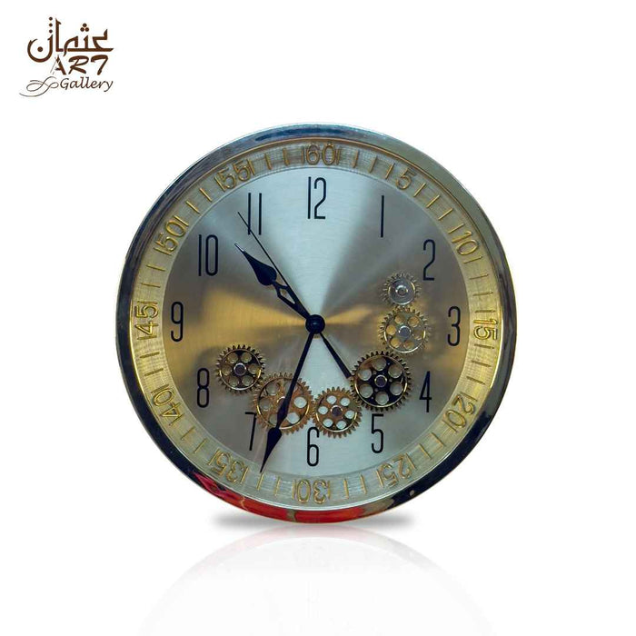
The Gold Gear wall clock is currently presented with a stated diameter of 13 inches and Gold and Silver colour options.
Its metallic design may suit a lounge, office, entrance or smaller furniture grouping that needs decorative contrast without the physical scale of an oversized clock.
A 13-inch clock can still create presence when the wall zone is compact or when the design has strong visual density. On a very wide sofa wall, however, it may need a more carefully defined placement area to avoid appearing isolated.
Before ordering, verify:
- The movement type
- Whether the visible gears move
- Whether any gear movement affects timekeeping
- The product weight
- The required battery
- The hanging method
- Current availability
Premium Gear Clock for classic and contemporary crossover
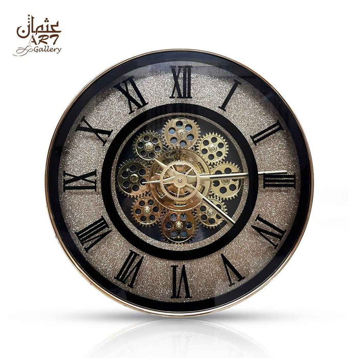
The black-and-gold Roman numeral gear clock has a stated diameter of 13 inches and is shown in Wing and Non Wing variants.
Roman numerals give the face a traditional structure, while the black-and-gold palette may work in modern or transitional interiors. This makes the design useful for rooms that combine classic furniture with cleaner contemporary surfaces.
The decorative centre creates visual interest, but it also makes hand contrast especially important. Inspect current product photographs carefully and consider how the face will appear from the room’s normal viewing distance.
The page does not clearly confirm that the visible gear elements are part of a mechanical timekeeping movement. Buyers should verify this directly rather than assuming that the word “gear” describes the mechanism.
Vintage Gear Wall Clock for a larger feature wall
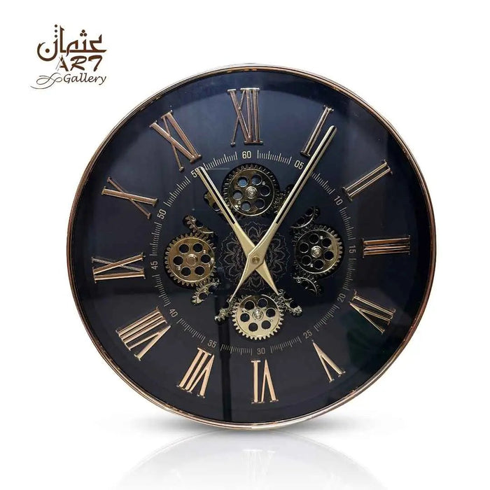
The vintage gear statement clock has a stated diameter of 22 inches. Its Roman numeral frame, open dial and visible decorative gear treatment give it greater physical and visual presence than the 13-inch options.
This style may suit:
- A broad living-room feature wall
- A drawing room with warm wood furniture
- An industrial-style office
- A hallway with sufficient width
- A reception area with a plain background
The current colour information requires careful checking. The selected colour field refers to “Mix of Steel Gray”, while descriptive copy also uses bronze-influenced wording. Review current photographs or contact support before matching it with furniture, curtains or wall paint.
A 22-inch diameter does not automatically mean the clock is suitable for every large wall. Its dark outline, open structure and decorative centre also influence visual weight.
Gold Pendulum Clock for vertical expression
The gold pendulum wall clock is shown with a 16-inch diameter field and a mix of gold and black.
A pendulum-style design can create a more vertical focal point than a standard circular clock. It may suit a hallway console, dining sideboard, drawing room or transitional living area.
Vertical designs require additional checks. The current page does not provide a verified total height that includes the pendulum. Buyers should confirm:
- Total height from top to bottom
- Pendulum clearance
- Whether the pendulum moves
- Whether the pendulum affects timekeeping
- Movement type
- Power requirement
- Weight and wall fixing
- Current availability
Product information note: Designs, specifications, variants and availability can change. Check the linked product page and confirm missing technical details before placing an order.
Decorative Gears, Quartz Movements and Pendulums Explained
Visible gears do not automatically make a clock mechanical. Gear elements may be fixed, may move for visual effect or may form part of the actual timekeeping mechanism. A quartz movement uses electronic regulation, while a mechanical movement uses stored mechanical energy and interconnected components.
Decorative exposed gears
Decorative exposed gears are gear-shaped elements included mainly for appearance. They can create an industrial, vintage or mechanical visual style even when they remain fixed.
Moving decorative gears
Some clocks include gears that rotate for visual effect. Their movement may be separate from the mechanism that controls the hands. Moving gears therefore do not automatically make the timekeeping movement mechanical.
Mechanical clock movements
A mechanical movement uses stored energy from a wound spring, weight or another mechanical source. The internal components regulate and transfer that energy to move the hands.
Do not describe a clock as mechanically driven unless the product information confirms the mechanism.
Quartz clock movements
A quartz movement uses electronic regulation and is commonly battery operated. Quartz describes the timekeeping system, not the visual style of the clock.
A gear-style clock can therefore use quartz timekeeping while displaying decorative gears.
Decorative pendulums
A decorative pendulum may swing for visual effect but remain separate from the timekeeping mechanism. Its presence does not automatically mean that the clock is a pendulum-regulated mechanical clock.
Pendulum-regulated mechanical clocks
In a true pendulum-regulated mechanical clock, the pendulum directly helps regulate timekeeping. This is different from a battery-operated decorative clock with an independently moving pendulum.
When buying online, ask three clear questions:
- Do the gears move?
- Do the gears control the timekeeping mechanism?
- Is the pendulum decorative or part of the timekeeping system?
This prevents misunderstandings created by product names or decorative styling.
How to Position a Statement Wall Clock Correctly
A statement clock should feel visually connected to the furniture and architecture around it. Poor placement can make even a carefully chosen clock look too small, too high or strangely detached.
Align the clock with the furniture
When placing a wall clock above a sofa, sideboard or console, use the furniture centreline as the first reference. Do not automatically centre the clock on the full wall.
This is especially important when the furniture is positioned away from the wall’s mathematical centre.
Leave enough breathing space
Negative space helps the eye recognise the clock as a focal point. Avoid placing the clock too close to shelves, frames, curtains or wall lights.
A decorative clock may need more breathing space than a simple face because its frame and internal details already create visual activity.
Avoid hanging the clock too high
Many statement clocks are placed close to the ceiling because the wall is tall. This separates the clock from the furniture and makes it harder to read.
The clock should feel part of the furniture composition. Test the position using a paper template cut to the product’s exact dimensions.
Consider the main sightline
Check the clock from the sofa, entrance, dining chair or office desk. The correct position may differ from what looks balanced when standing directly in front of the wall.
A feature wall clock should be easy to notice and read from the room’s most common viewing positions.
Mistakes That Make a Statement Clock Look Wrong
A statement clock usually looks wrong because of its relationship with the room, not because the clock itself is unattractive.
- Choosing by diameter alone: Consider frame thickness, face density, dark colour and open space.
- Ignoring visual weight: A dense dark clock may feel much larger than a lighter open-frame design.
- Using a busy clock on patterned wallpaper: Give detailed designs a calmer background.
- Repeating too many metallic accents: Let the clock remain one of the room’s main decorative features.
- Hanging the clock too high: Connect it visually with the furniture below.
- Centring it on the wall instead of the furniture: Use the sofa, sideboard or console as the main anchor.
- Ignoring hand contrast: A decorative face should still display the time clearly.
- Assuming visible gears are functional: Confirm the actual movement and gear behaviour.
- Failing to confirm total dimensions: Pendulums and decorative extensions may increase the total height.
- Ignoring maintenance access: Leave enough room to remove the clock and replace its battery.
- Choosing an ornate design because it is labelled luxury: Judge it by proportion, finish and room compatibility.
- Matching every object exactly: Use a related accent rather than repeating the same colour and finish throughout the room.
- Buying before checking photographs from several angles: Front-facing images may not show depth, frame thickness or hanging requirements.
Online Buying Checklist for Pakistani Shoppers
Buying a statement wall clock online requires more verification than selecting a small decorative accessory. Product photographs can make dimensions difficult to judge, while titles may not explain the mechanism accurately.
Before ordering a luxury wall clock in Pakistan, confirm the following information.
Dimensions and proportion
- Exact diameter or width
- Total height
- Depth from the wall
- Pendulum length
- Decorative extensions beyond the main dial
Movement and sound
- Quartz or mechanical movement
- Ticking or available noise information
- Battery or power requirement
- Whether the pendulum moves
- Whether visible gears move
- Whether the gears are connected to timekeeping
Colour and finish
- Current colour variant
- Front, side and close-up photographs
- Appearance under warm and cool lighting
- Whether the finish is described consistently
- Whether the frame appears reflective, muted or textured
Installation requirements
- Product weight
- Hanging point
- Recommended wall fixing
- Suitability for the intended wall material
- Access for battery replacement
- Clearance for pendulum movement
Ordering and customer support
- Current availability
- Delivery coverage
- Delivery charges
- Expected dispatch information
- Payment methods
- Exchange or return terms
- Customer-support contact
- Packaging details
- Procedure for reporting transit damage
Save a copy or screenshot of the specifications shown at the time of ordering. If an important detail is missing, ask the seller before making payment rather than relying on assumptions from the product title.
Final Decision. Which Statement Clock Should You Choose?
Choose a gold gear design when the room needs a controlled metallic focal point and the wall has sufficient negative space. This style can work in modern, transitional and Art Deco-influenced interiors.
Select a Roman numeral clock when you want a structured face that connects classic design with contemporary colour. Black-and-gold Roman numeral clocks can bridge traditional furniture and cleaner modern surfaces.
Consider a vintage-industrial clock when the room already includes wood, leather, dark metal or textured finishes. Give a visually dense design a plain wall so its details remain clear.
Choose a pendulum design when the wall needs vertical expression and there is enough clearance beneath the main dial. Confirm the total height and mechanism before ordering.
Select a restrained minimal clock when the wall already contains artwork, wallpaper, decorative panels or several accessories. A simpler design can provide function and balance without adding more visual competition.
The strongest luxury wall clocks are not automatically the largest, most expensive or most decorative. They are the designs whose scale, visual weight, finish, readability and function work together with the room.
Once you understand the wall’s requirements, explore the wall-clock collection to compare current decorative, Roman numeral, gear and pendulum-style options for Pakistani homes.
Frequently Asked Questions
What makes a wall clock luxurious?
A wall clock looks luxurious when its proportion, detailing, finish and placement feel controlled. A consistent colour, readable face and sufficient negative space usually matter more than price or ornamentation alone. The design should also connect with the room through shape, colour, visual weight or finish.
How do I choose a statement wall clock?
Measure the usable wall zone, identify the furniture anchor, assess the wall colour and review the clock’s readability from a normal distance. Then verify total dimensions, movement, weight and hanging requirements. The clock should feel connected to the furniture rather than simply filling an empty wall.
Which luxury clock is best for a living room?
The best design depends on the wall size, furniture width, viewing distance and room style. A gold gear clock may suit a modern or transitional lounge, while a Roman numeral or vintage clock may work better in a classic or industrial room. Choose according to proportion and readability rather than style alone.
What size statement clock should I use above a sofa?
Choose the size according to the usable area above the sofa and the clock’s visual weight. A dense dark clock can appear larger than an open-frame design with the same diameter. Leave clear space around the clock and align it with the sofa grouping below.
Should a wall clock match the furniture?
A wall clock does not need to match every piece of furniture. It should share one connecting element, such as a gold accent, black outline, circular form, warm finish or similar visual weight. Exact matching throughout the room can look forced.
Do gold wall clocks suit modern interiors?
Gold wall clocks can suit modern interiors when the form remains controlled and the finish is repeated selectively. Gold works well against warm white, cream, light grey, charcoal, deep green and muted blue. Avoid surrounding the clock with too many competing metallic decorations.
What wall colour suits a black-and-gold clock?
Warm white, cream, beige and light grey usually give a black-and-gold clock clear contrast. Deep green or navy can create a stronger, more dramatic effect. Check the visibility of black hands and numerals, especially when placing the clock on a darker wall.
Are Roman numeral wall clocks difficult to read?
Roman numeral clocks can be easy to read when the numerals are bold, well spaced and clearly separated from the centre. Thin numerals, low contrast or a highly detailed dial may reduce readability. Review the clock from the distance at which it will normally be viewed.
Are gear wall clocks genuinely mechanical?
Not necessarily. A gear wall clock may have fixed decorative gears, moving decorative gears or gears connected to the functional mechanism. A genuinely mechanical clock uses stored mechanical energy to keep time. Verify the movement rather than relying only on the product name.
Is a pendulum clock suitable for a modern living room?
A pendulum clock can work in a modern living room when its colours, face and silhouette are controlled. It may also suit transitional interiors that combine traditional and contemporary elements. Confirm the total height, pendulum clearance and whether the pendulum is decorative.
Where should a statement wall clock be placed?
Place it on a wall that has a clear viewing angle and enough negative space. Above a sofa, console or sideboard, align the clock with the furniture grouping. Avoid positioning it too close to shelves, curtains, lights or competing artwork.
How high should a wall clock hang above furniture?
The clock should sit close enough to feel connected to the sofa, sideboard or console while leaving clear visual space between them. Avoid placing it near the ceiling simply because the wall is tall. Test the position using a paper template before drilling.
What should I verify before ordering a wall clock online in Pakistan?
Confirm exact dimensions, total height, colour, movement, battery requirement, noise information, weight, gear functionality, pendulum function, hanging method and current availability. Also check delivery coverage, payment methods, packaging information and exchange or return terms with the seller.
